Green Chem Labs
Design That Cleans Up
- Brand Identity
- Brand Language
- Brand Architecture
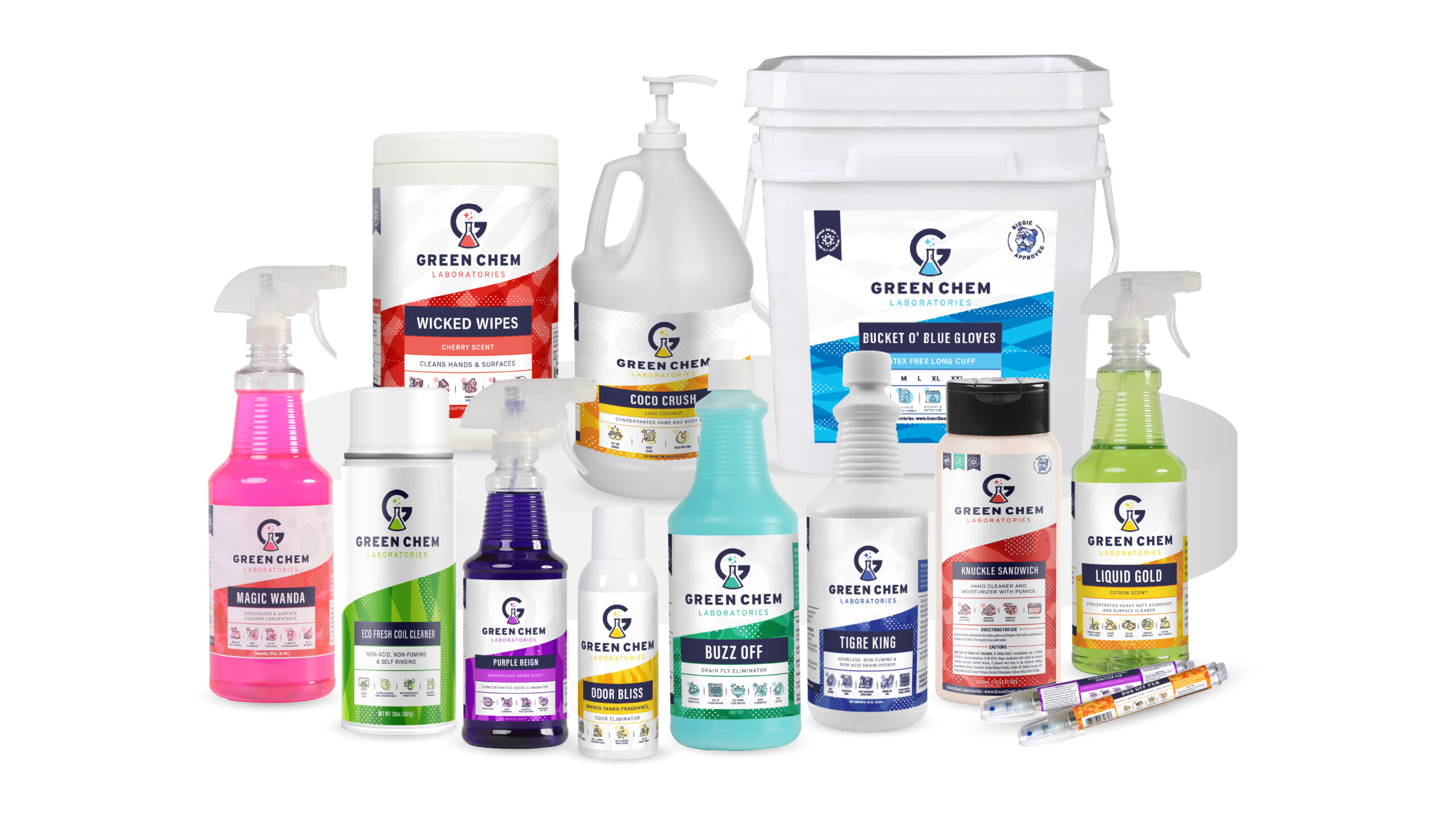
- Packaging
The Challenge
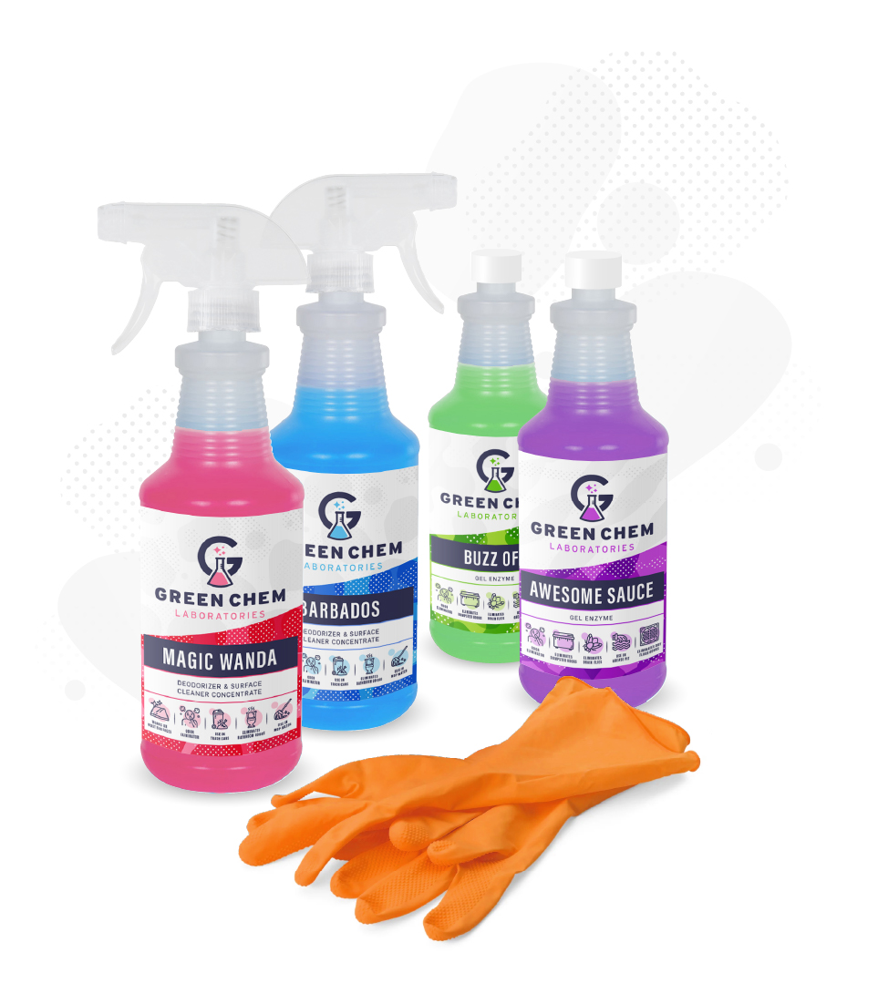
The founder of Green Chem Laboratories is a force of nature and that force can be found in the vast range of industrial and commercial cleaning products that she has brilliantly and masterfully created. Her boldness and commitment to eco-friendly and efficacious solutions is a welcome disruptor to a category that perpetuates the status quo. With her beloved mascot, Biggie, she asked us to create a brand expression as bold as the chemical reactions produced from her expertise, experience, elbow grease and her heartfelt love for cleanliness.



The Solution
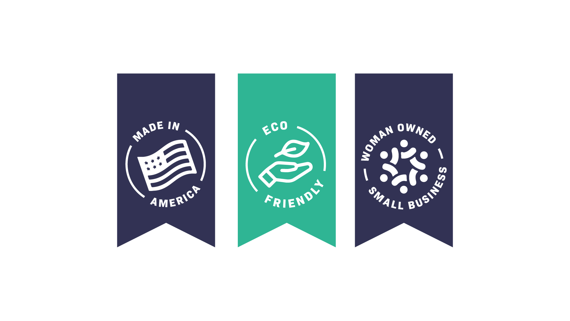
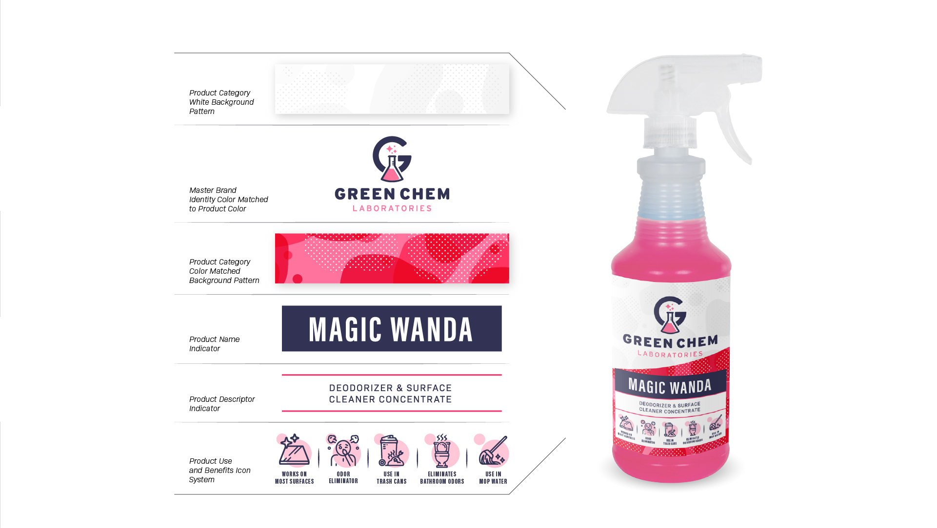
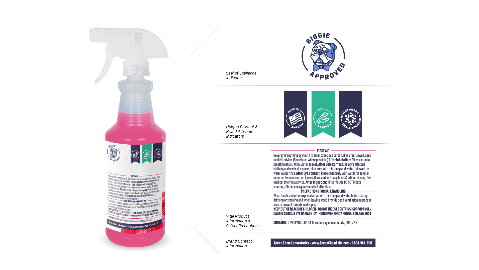
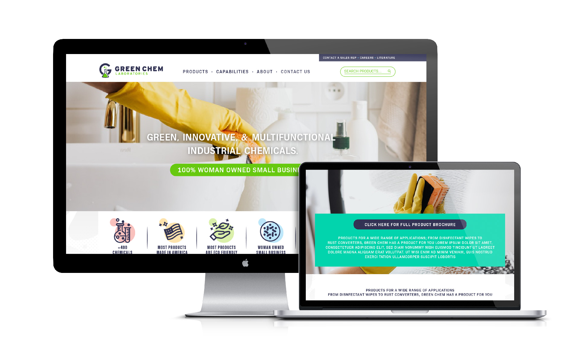
Our objective was to leverage the power of design and its emotive qualities to communicate Green Chem Laboratories’ many sought after attributes; Made in America, Woman Owned, Environmentally Responsible, Multiple Products and Quick Turnaround Time. With these attributes communicated, a foundation was established to credibly communicate the multitude of cleaning solutions this brand has to offer.

The Approach
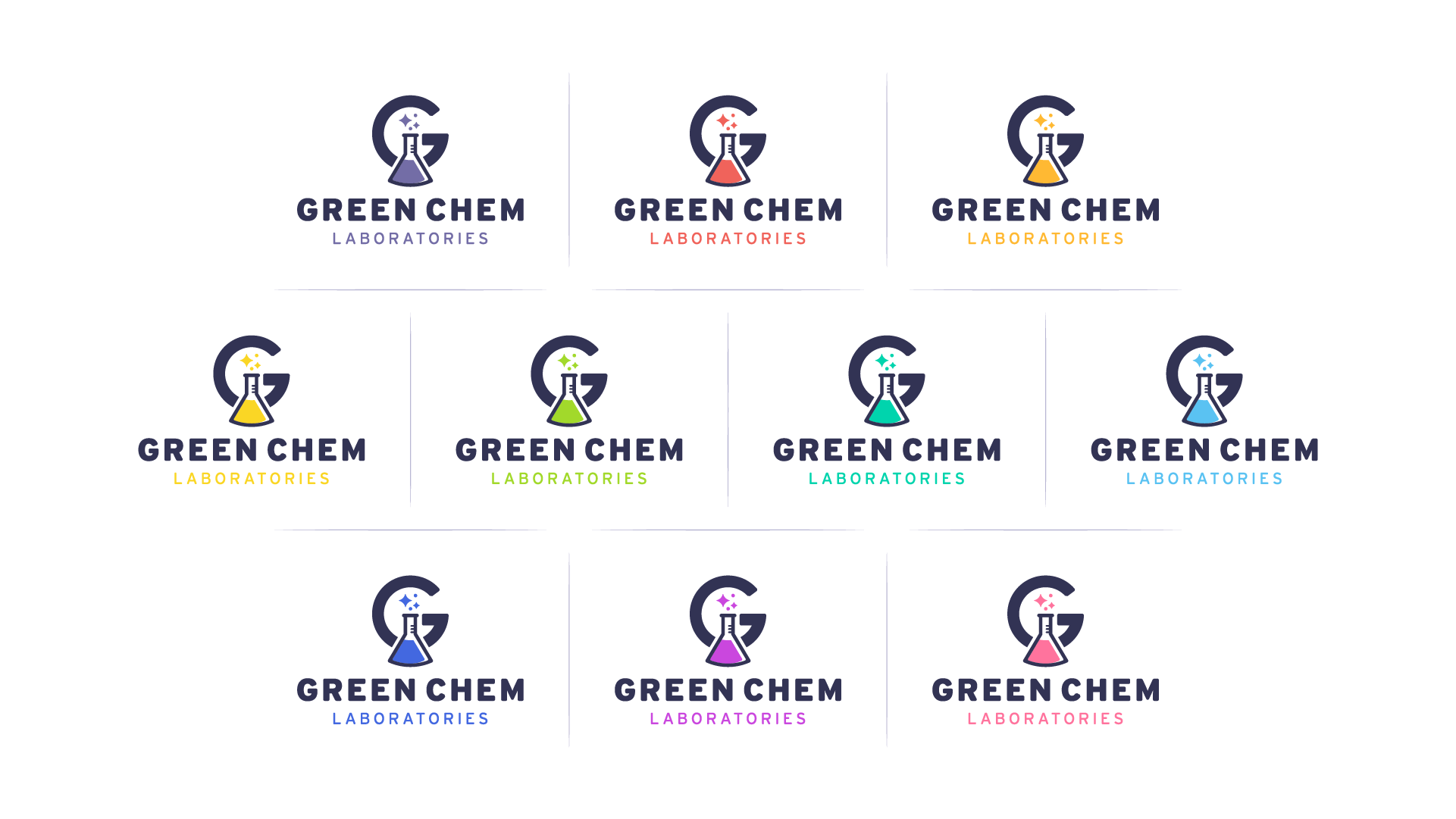
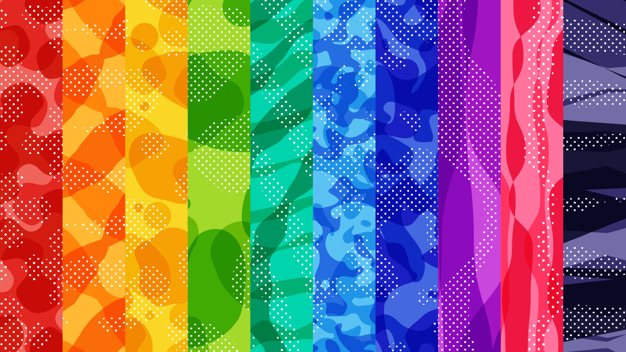
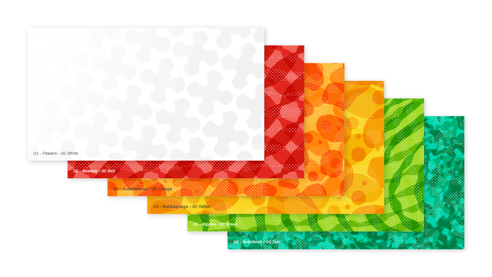
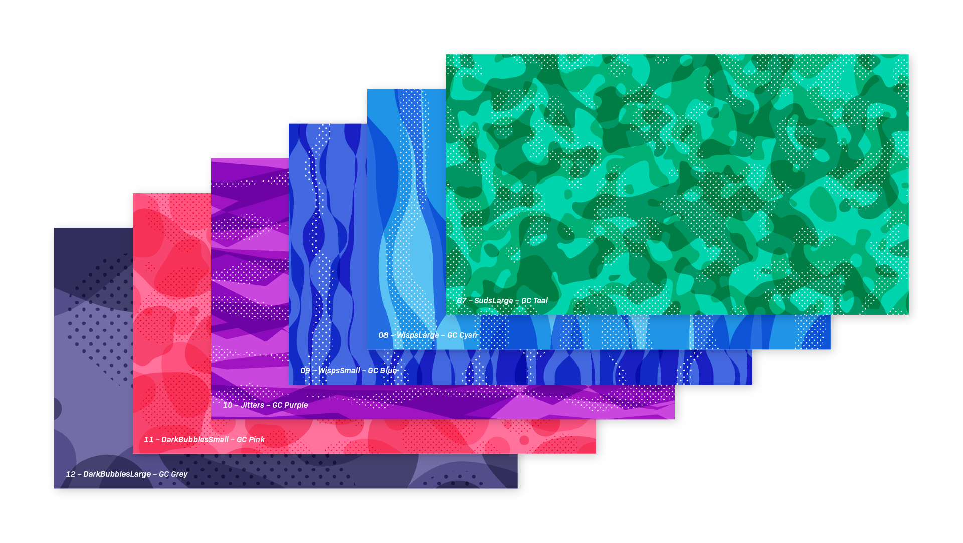
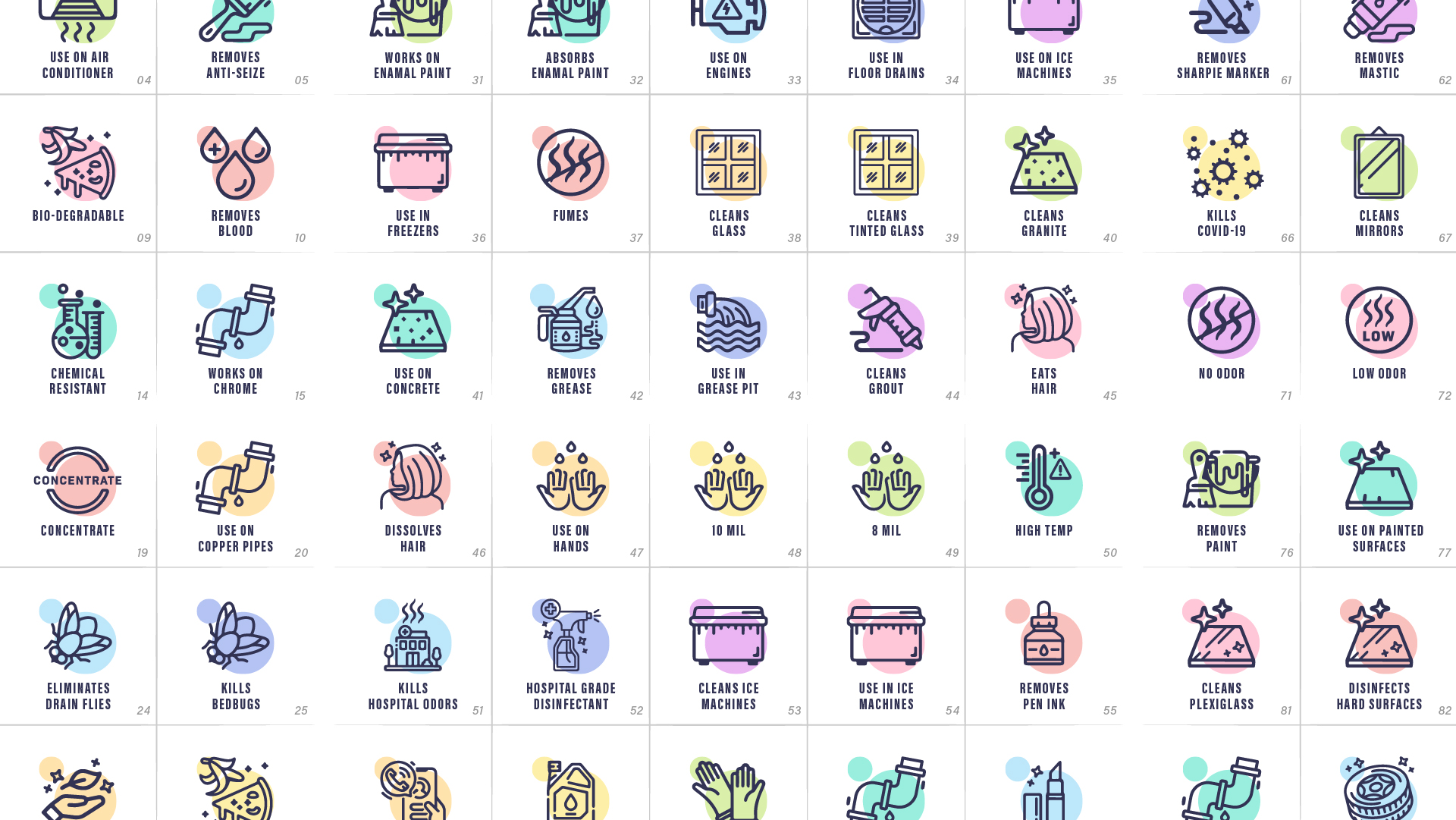
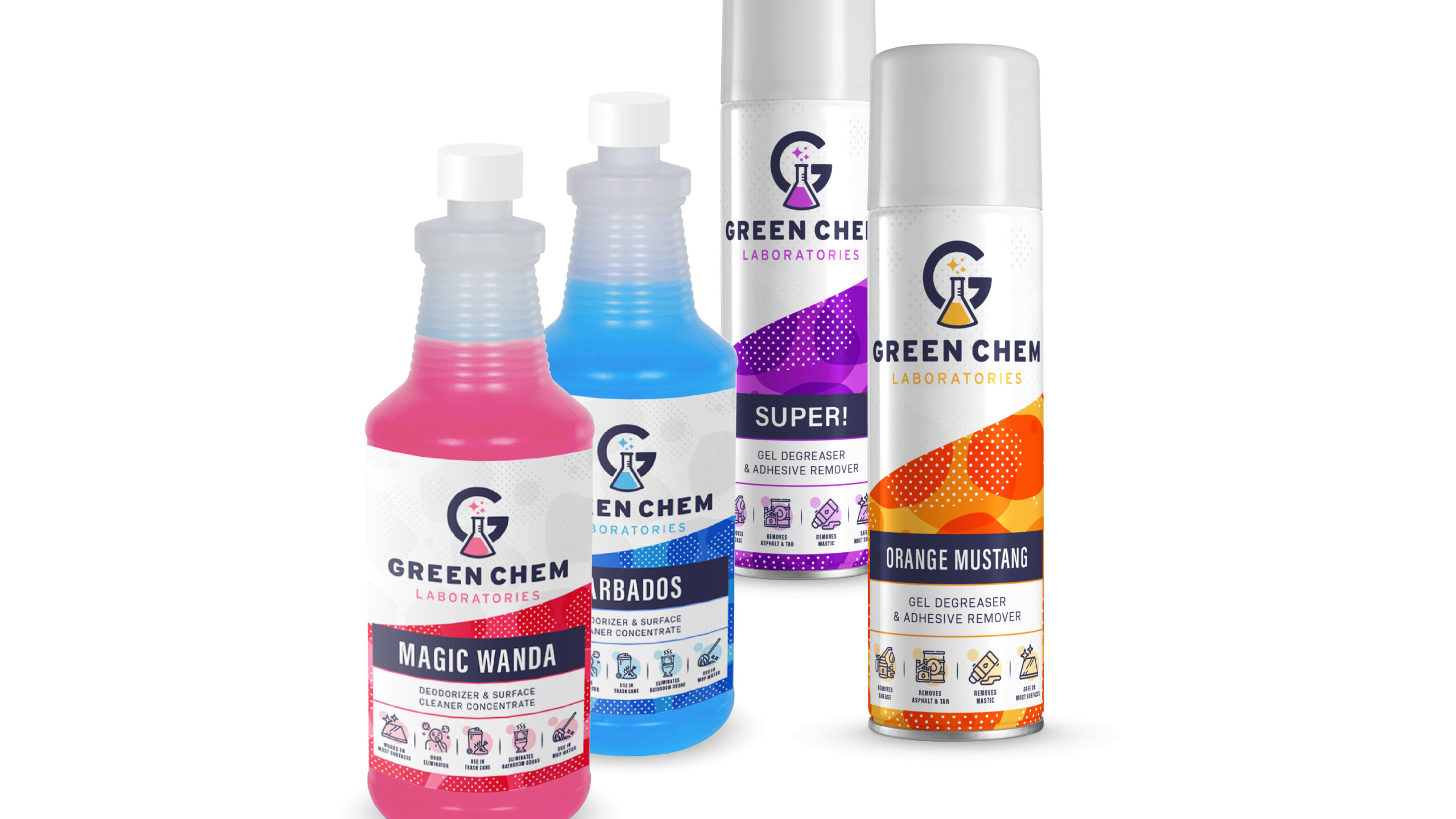
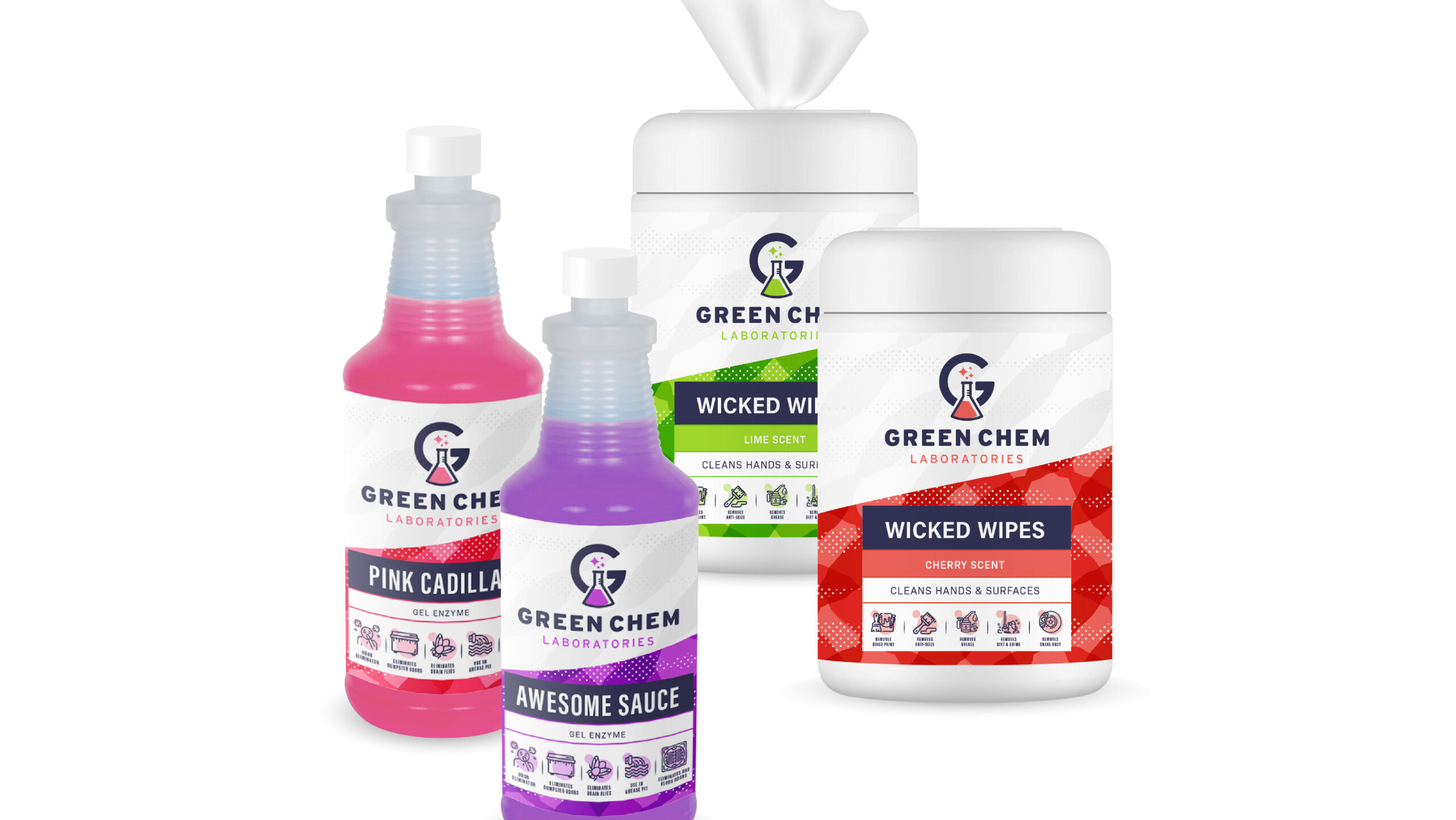
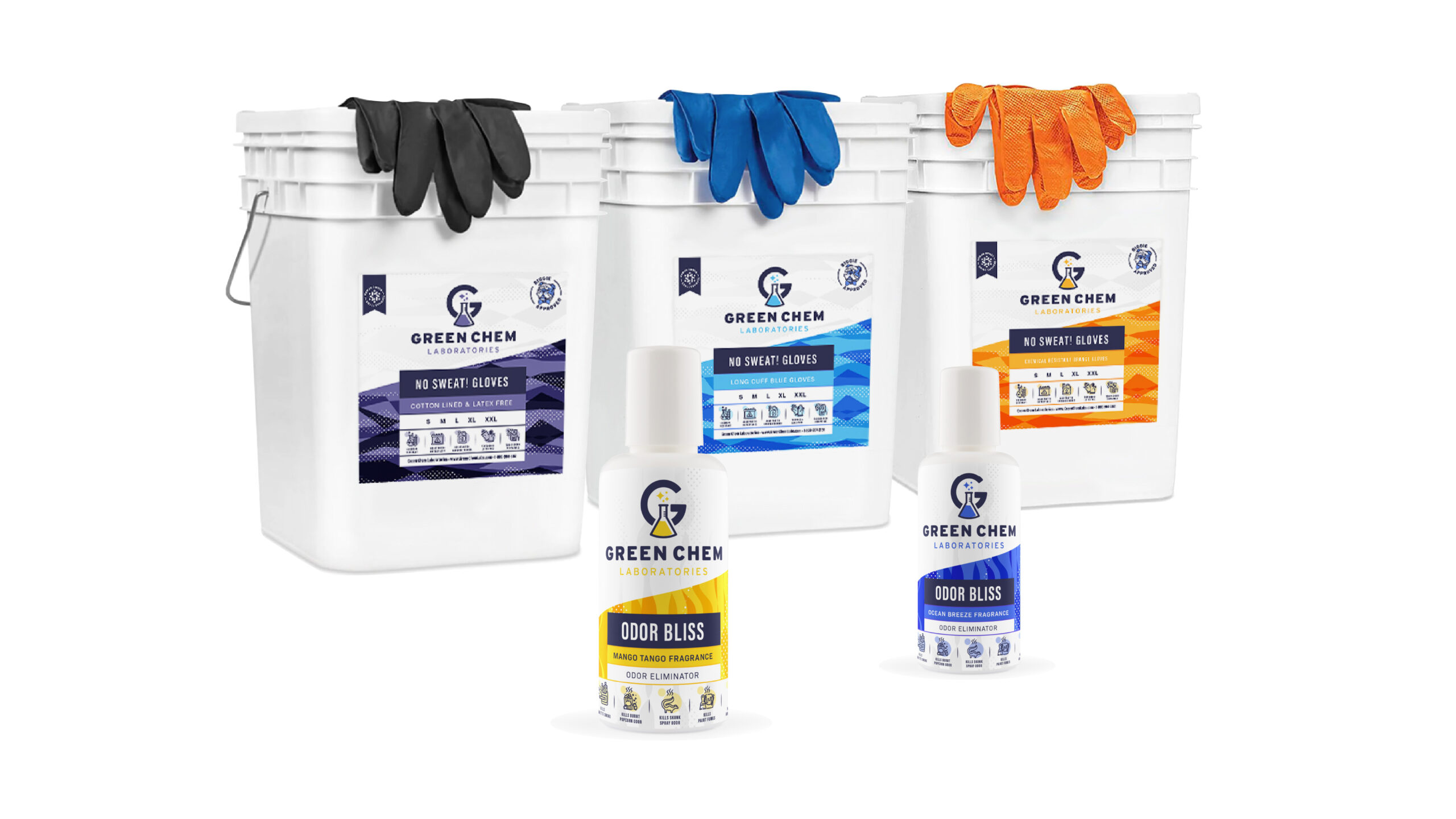
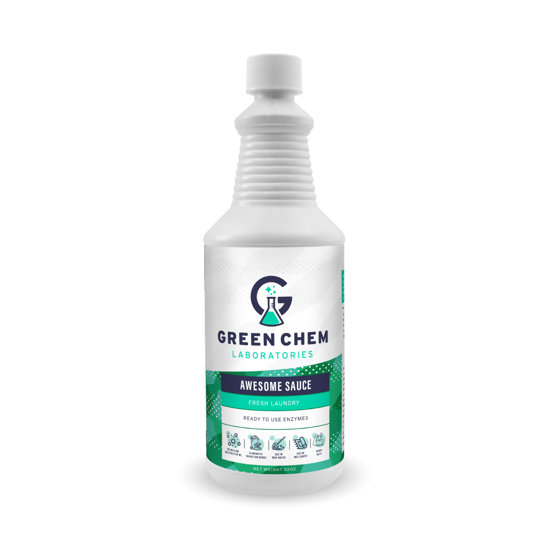
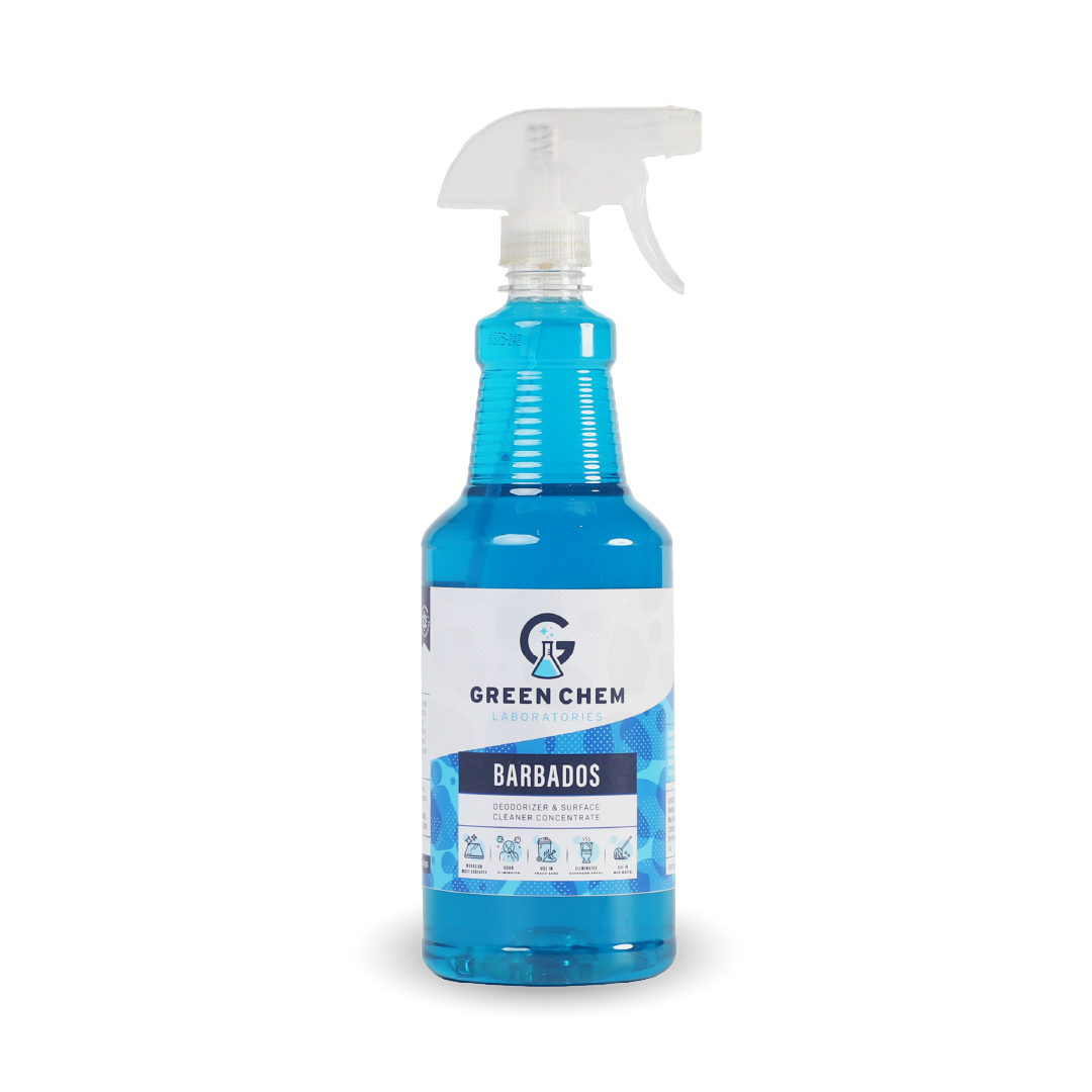
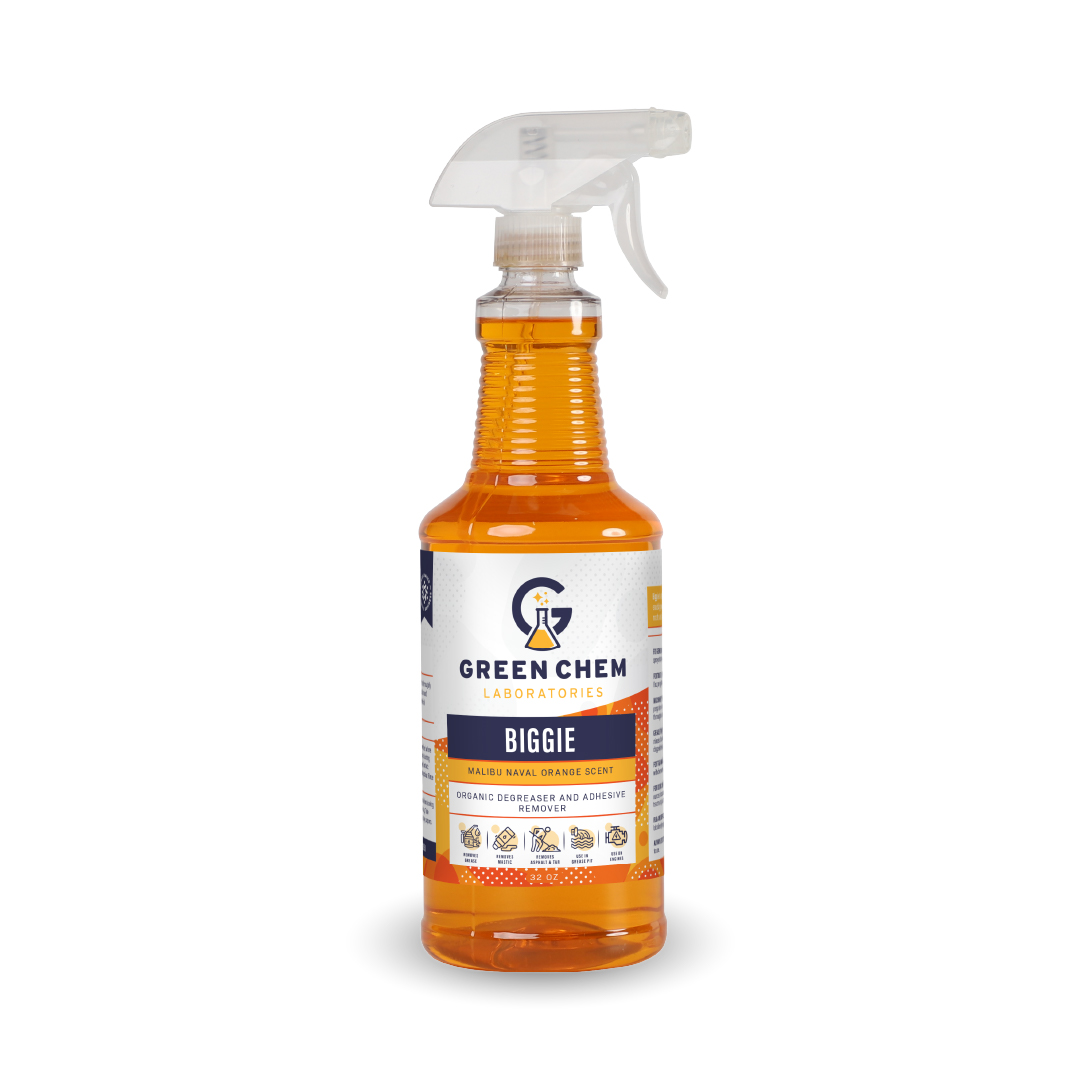
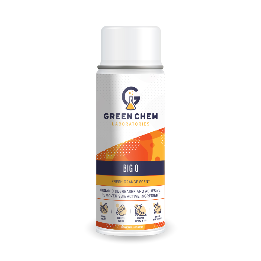
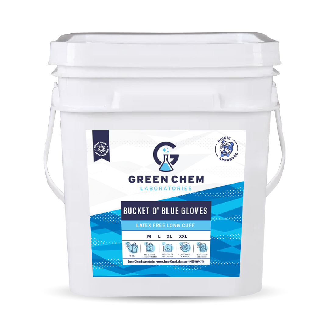
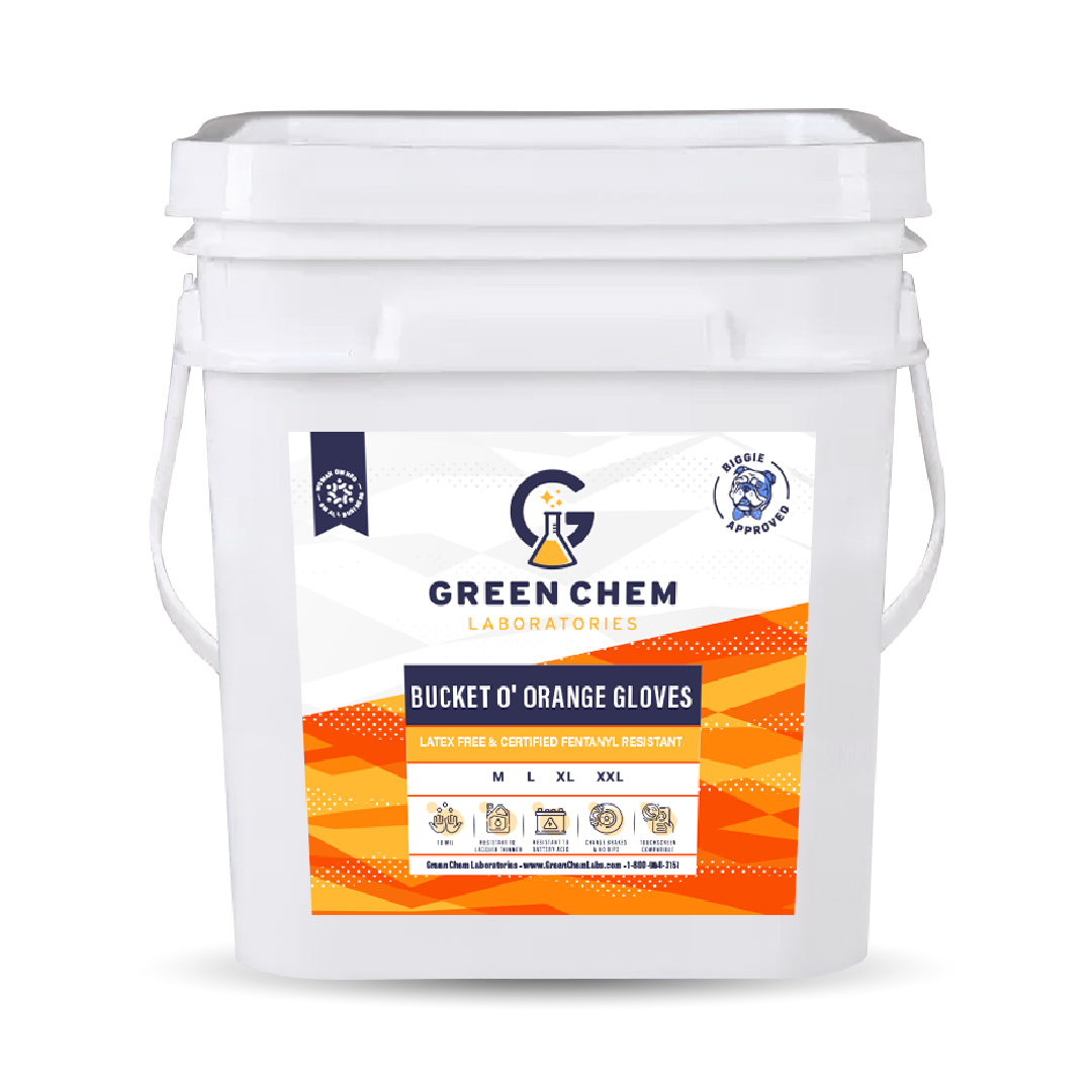
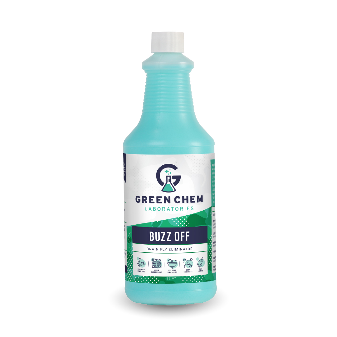
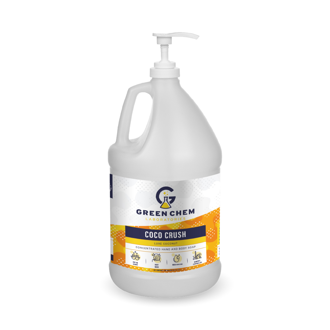
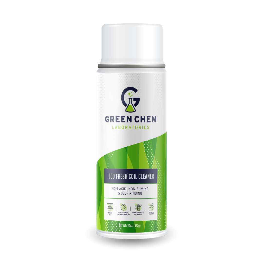
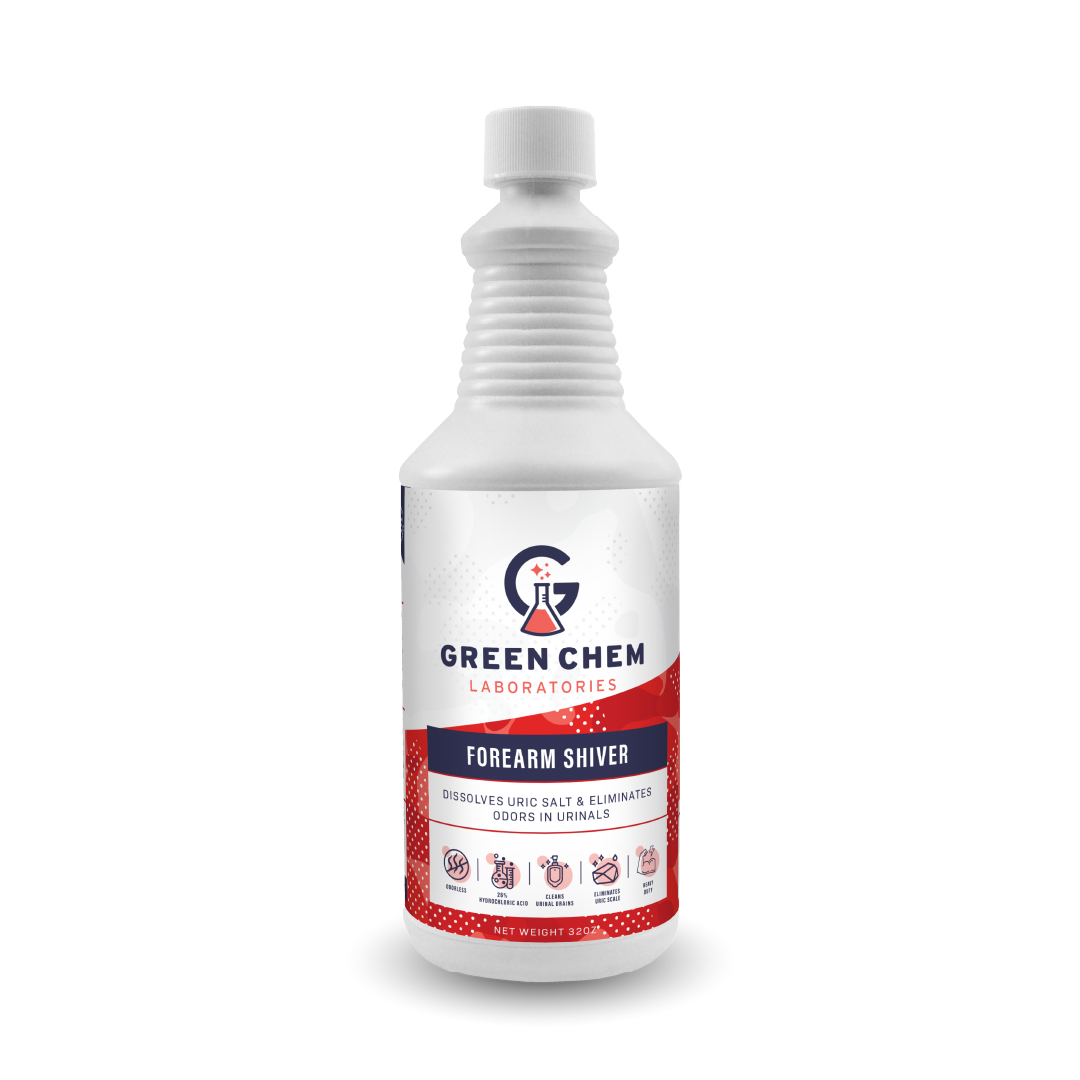
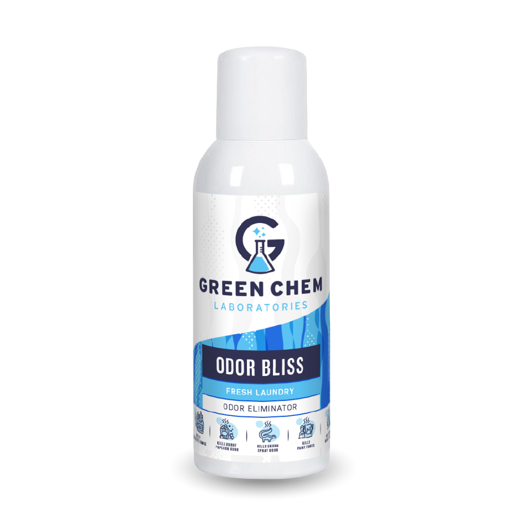
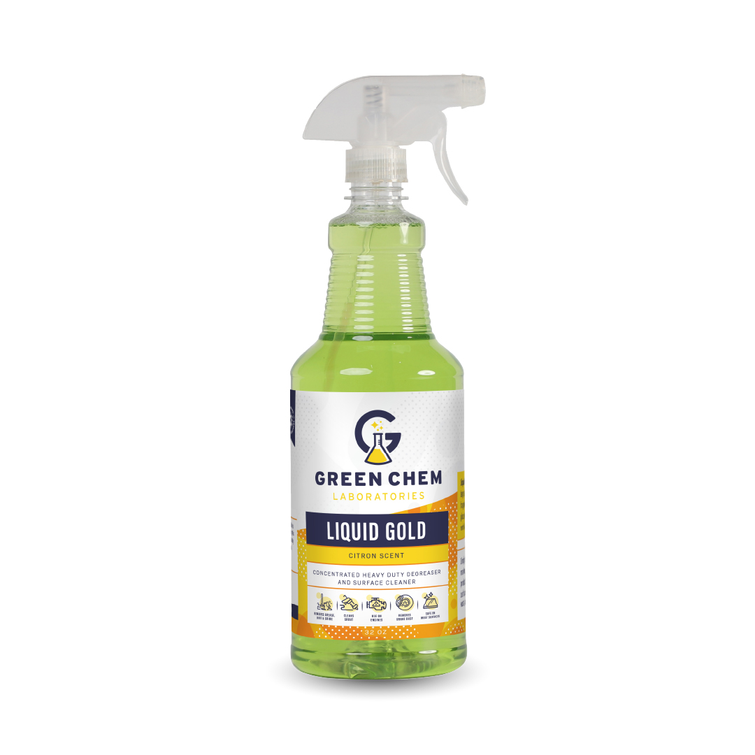
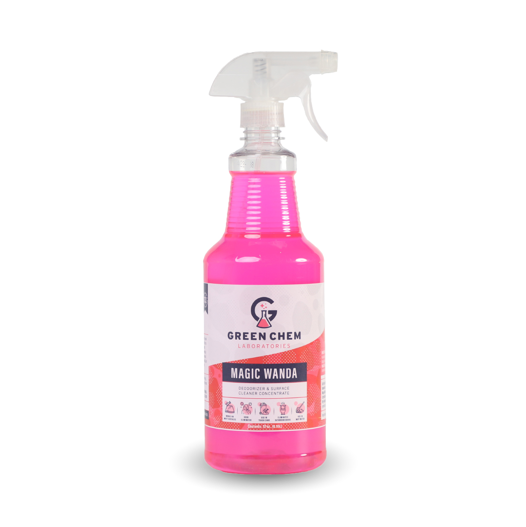
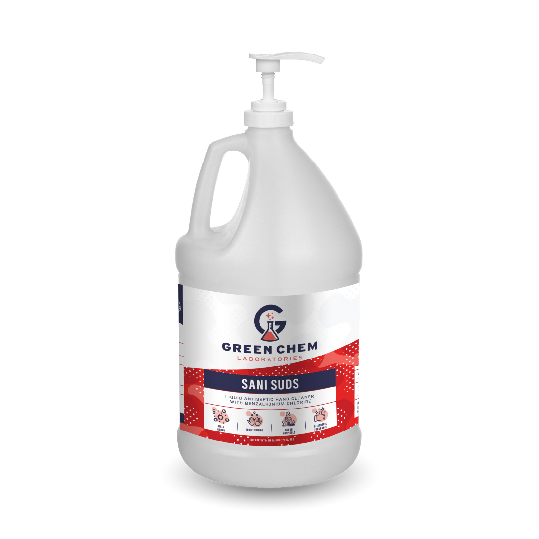
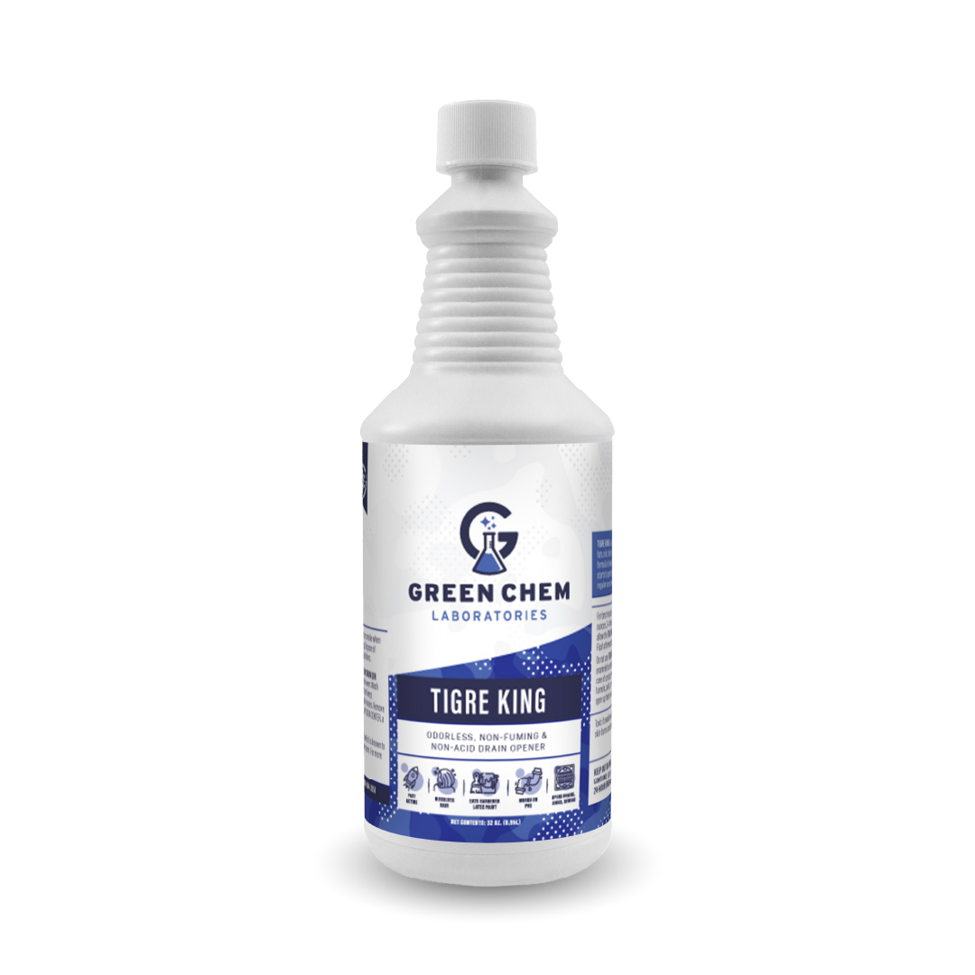
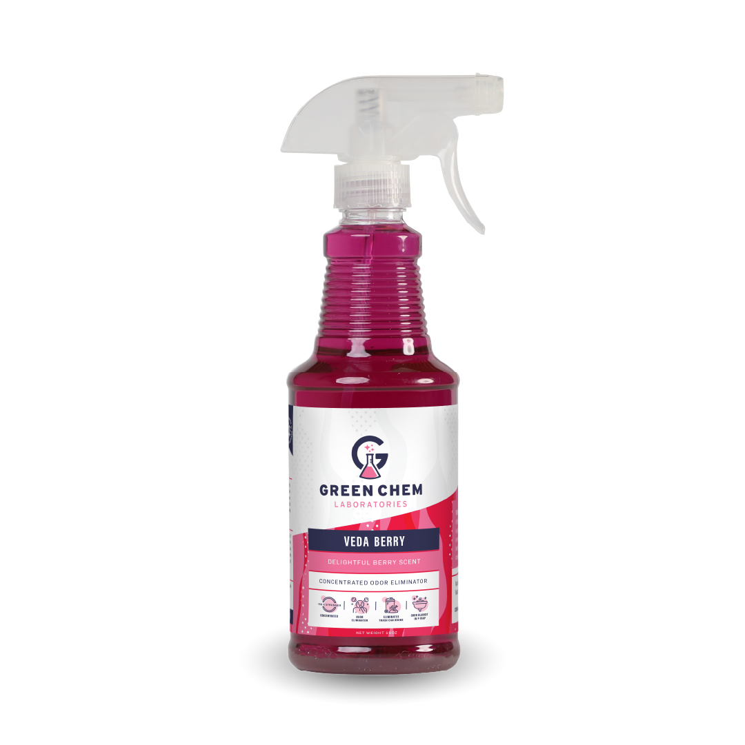
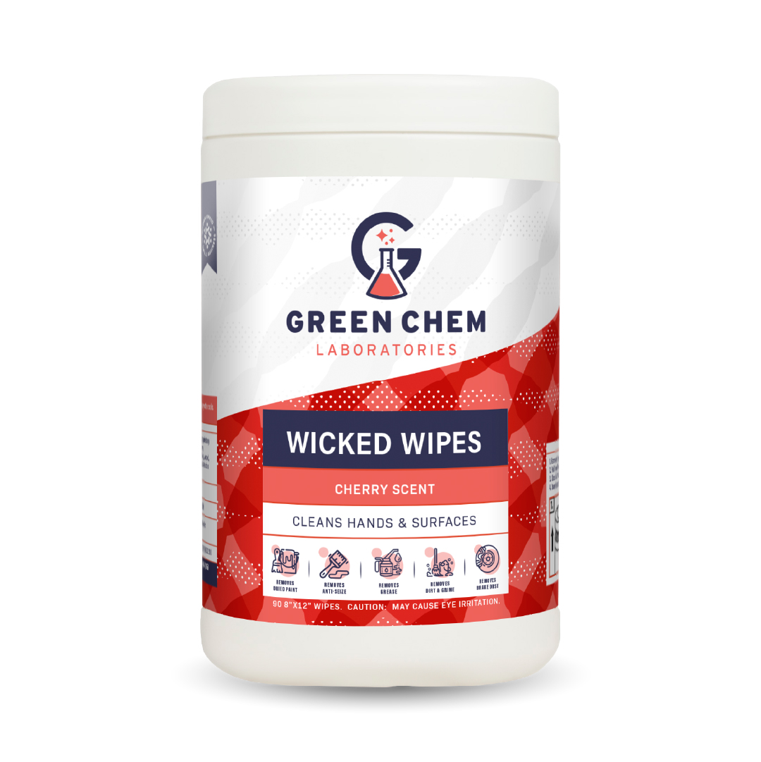
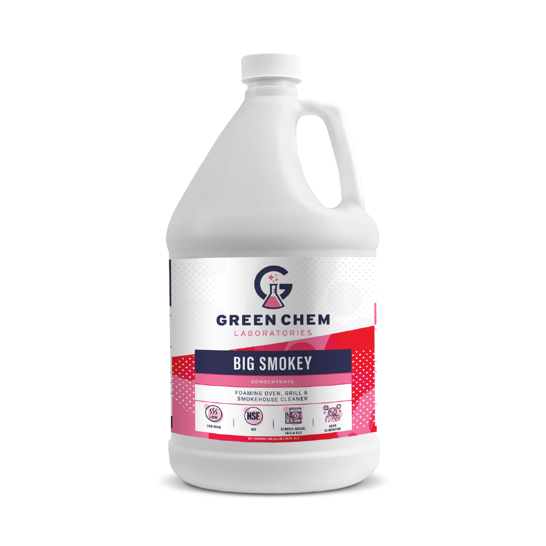
By creating a synergistic expression, where the iconography of the brand’s attributes are in harmony with the iconography representing the many categories of products offered, we built a thoughtful framework to help the audience successfully navigate a vast portfolio with the assurance that the brand’s strength and character were ever present. The bold and powerful efficacy of the products comes through in the depth of patterns created as well as the dynamism conveyed through the color change of the brand’s primary identity. The color change aligns with the many different liquid colors and fragrances while supporting the underpinning of innovation fueling the brand’s success. In total, all elements establish clarity and a visual hierarchy that the end-user can rely on each time they engage with a Green Chem Laboratories' product.






In Conclusion
Whether it be industrial cleaning products, a consumer packaged goods product or a spirits offering, the truth of a brand and its “heart” inspires design that communicates a clear point of difference that breaks through. And, we’ve learned too, that a mascot like Biggie is clearly a brand asset.
