
SUSAN G. KOMEN FOR THE CURE
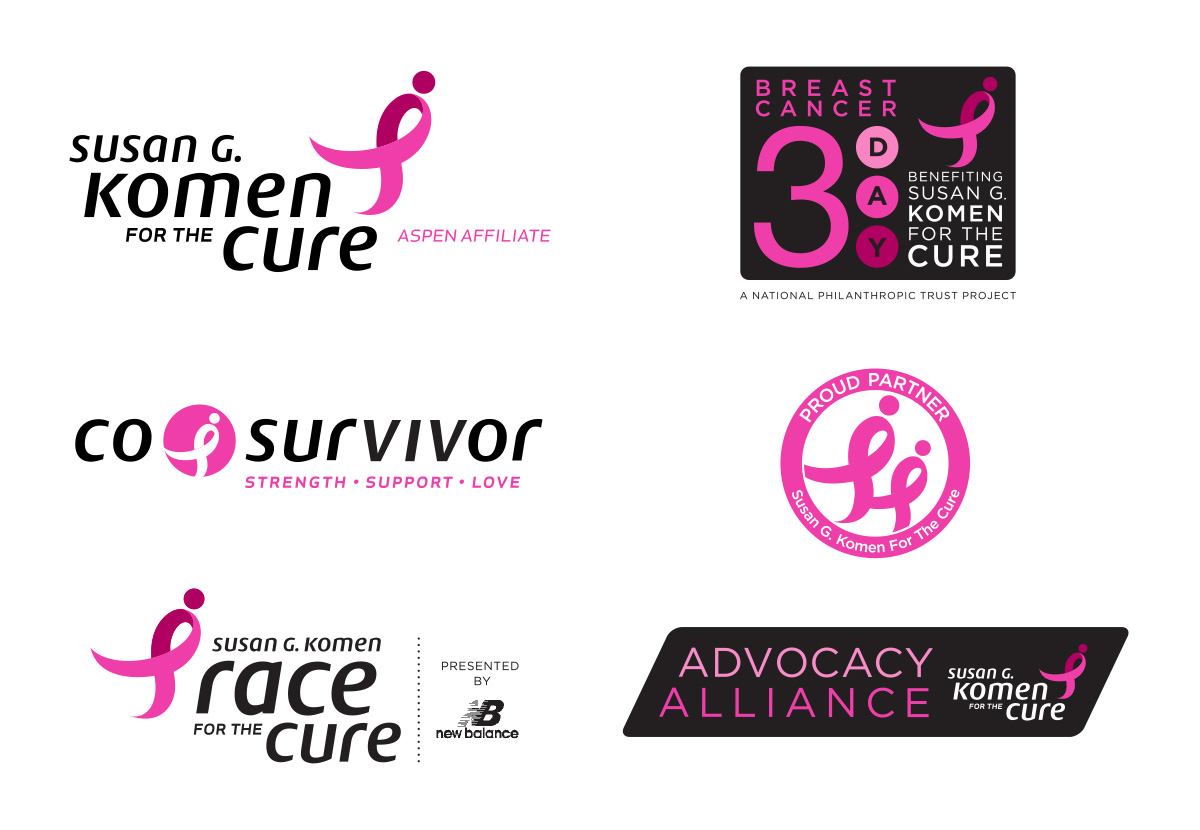
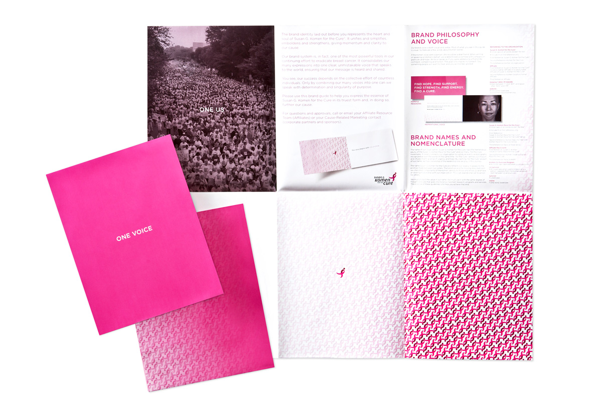
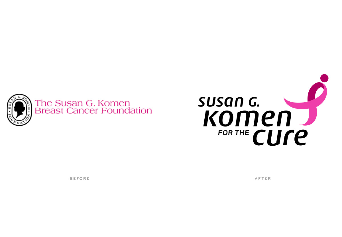
With an outdated logo and an “unattributed” For The Cure race and other programs, the Komen Foundation needed to rejuvenate their brand to increase public awareness and organizational cohesion. They were looking for a culturally iconic expression that communicated power, hope, and energy.
- NAMING
- IDENTITY
- VISUAL LANGUAGE
- BRAND ARCHITECTURE
- BUSINESS SYSTEM
- PACKAGING
- PROMOTIONAL ITEMS
- EMPLOYEE COMMUNICATION
- INTERACTIVE DESIGN
- GRAPHIC STANDARDS


“You have given me possibly the greatest gift of my career. The creative, sharp, spirited work you’ve produced will take this organization to our mission and beyond.”

