
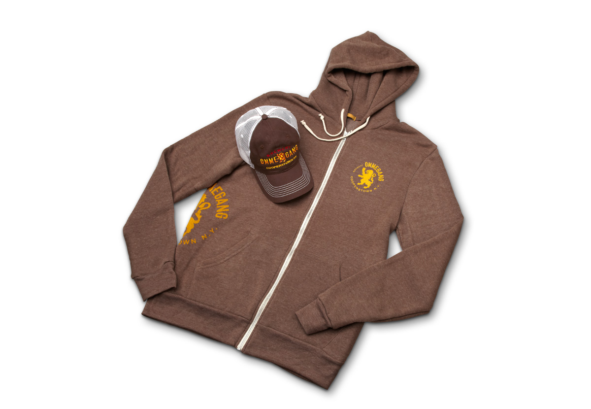
BREWERY OMMEGANG
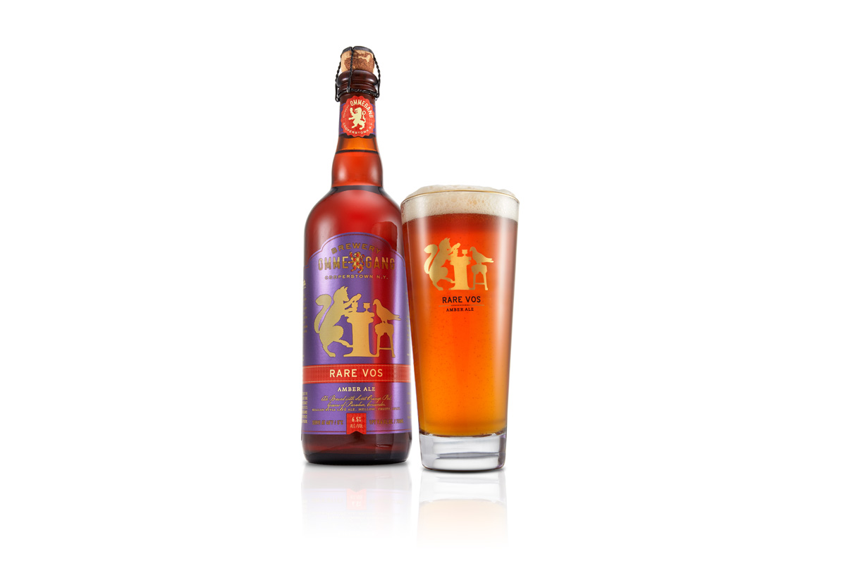
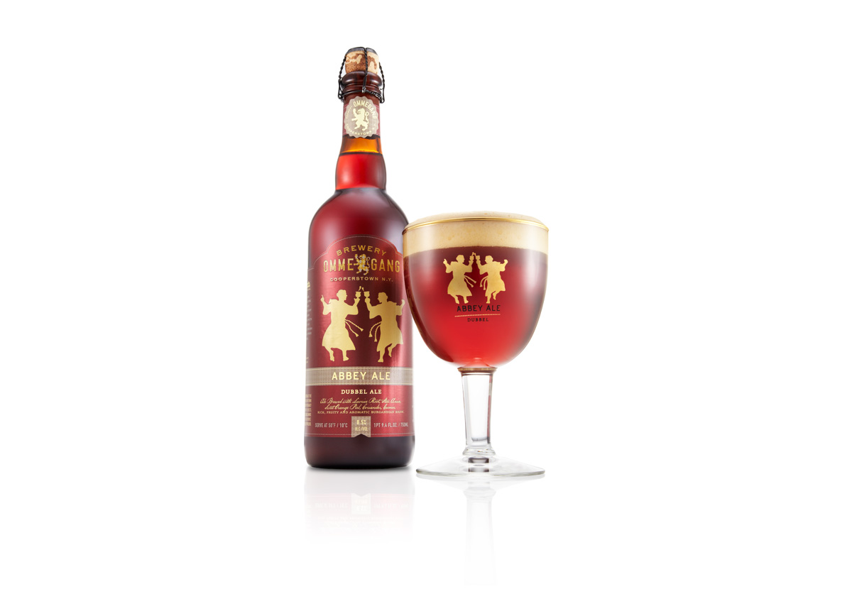
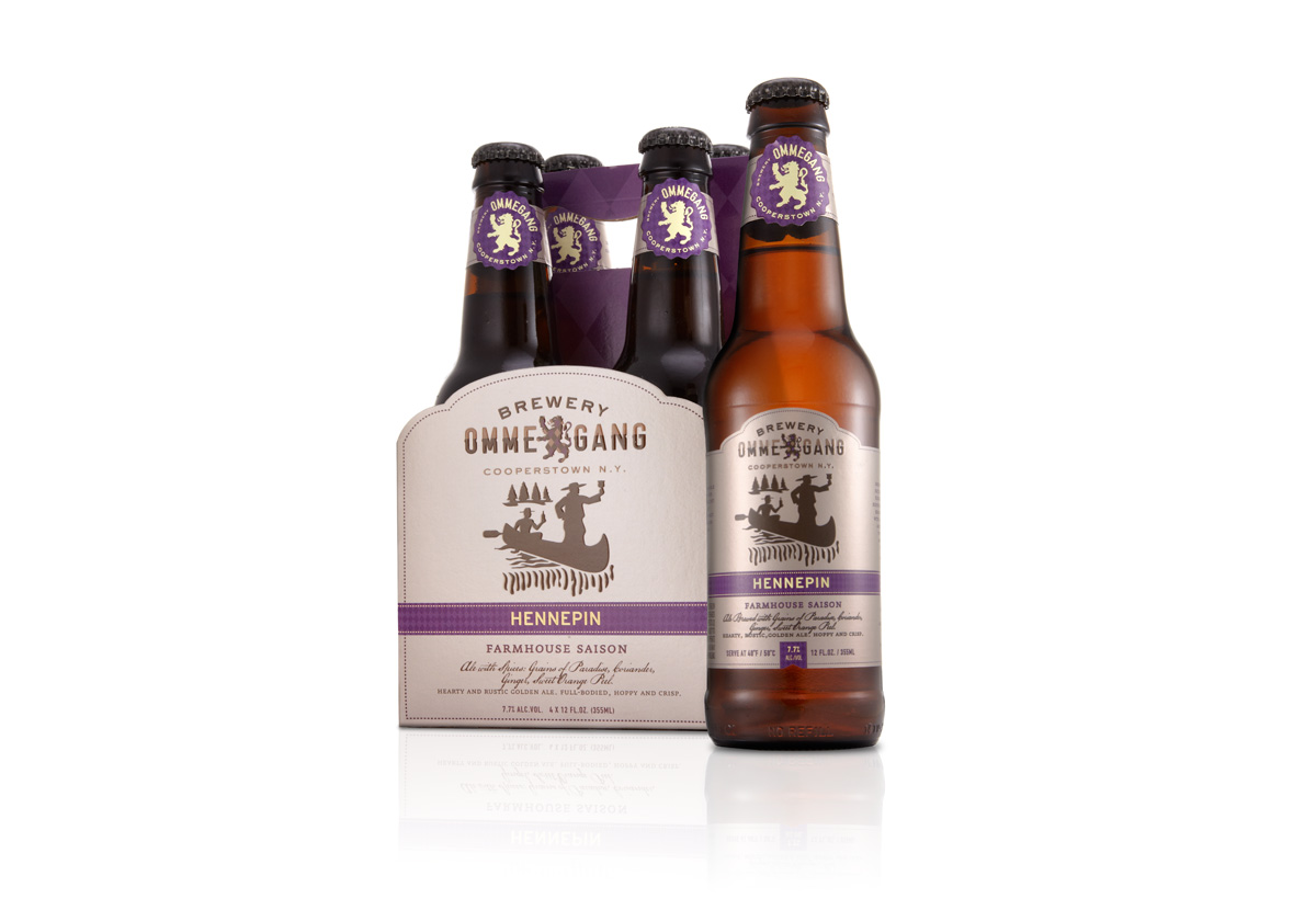
We designed a distinctive identity system to cohesively present numerous Belgian-inspired recipes with artful, handcrafted design. Each individual brew has a common quality but a unique taste, and each silhouette is a witty prelude to its story. The strong brand language surrounds every application, uniting the varied ales and providing Brewery Ommegang with a fluid, expandable platform. An unmistakable family resemblance is critical to the brand’s shelf appeal.
- IDENTITY
- VISUAL LANGUAGE
- PACKAGING SYSTEM
- POINT OF SALE
- ENVIRONMENT

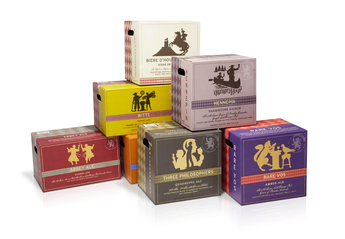
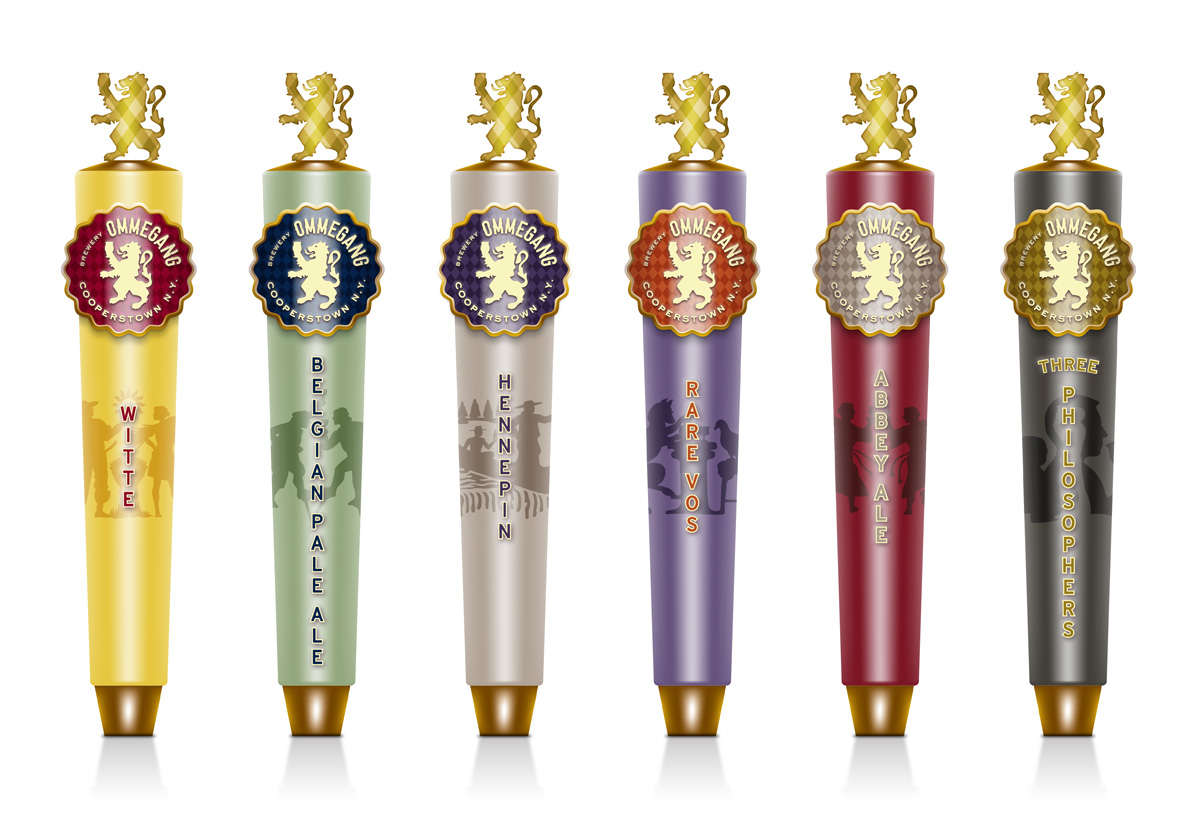
“We needed a new design to give us a family face and a system to work within for better shelf recognition. Duffy did a fantastic job. The packaging—from 4-packs to cartons and tap handles—is building a coherent and recognizable brand image.”