SolTec Health
Design That Heals
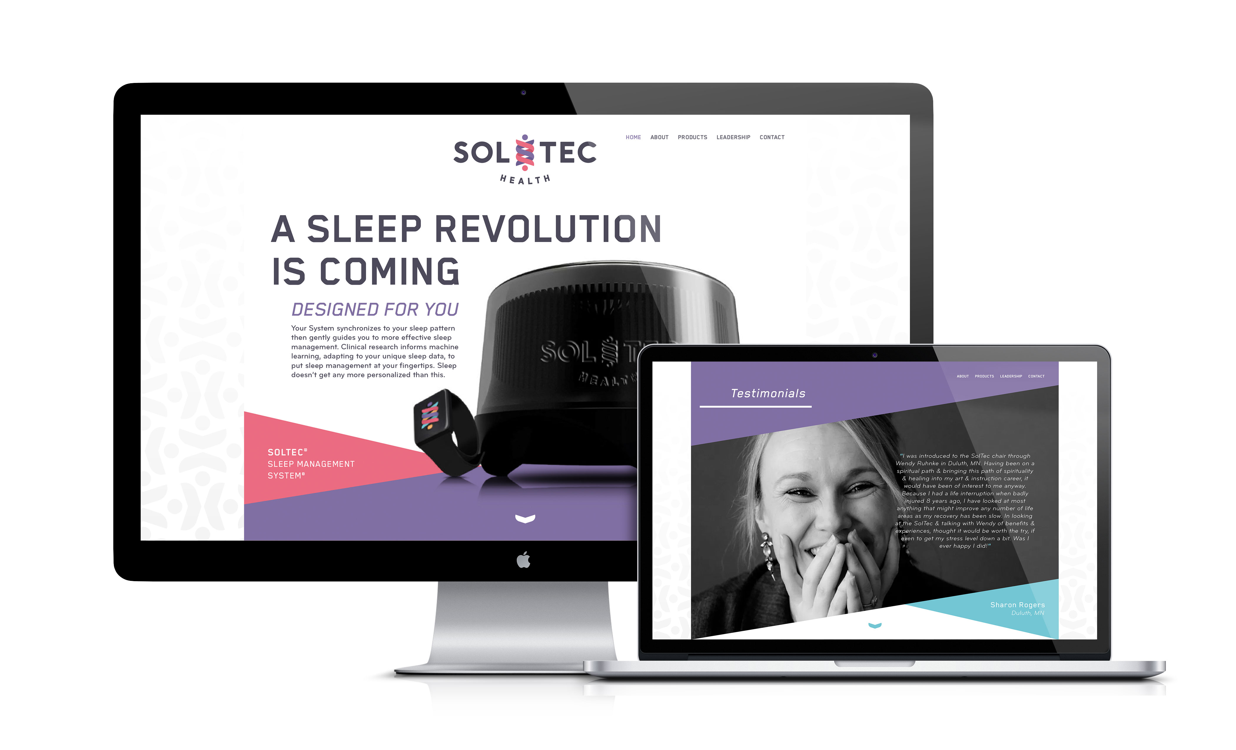
- Brand Identity
- Brand Language
The Challenge
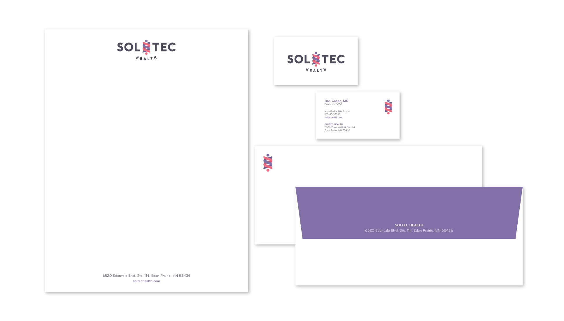
The brilliant minds at SolTec Health asked us to create an identity to communicate their technology’s ability to harness the body’s healing power. Their name expresses the unique duality that is manifested in their science and it was our challenge to visually support this depth of meaning.
The Solution
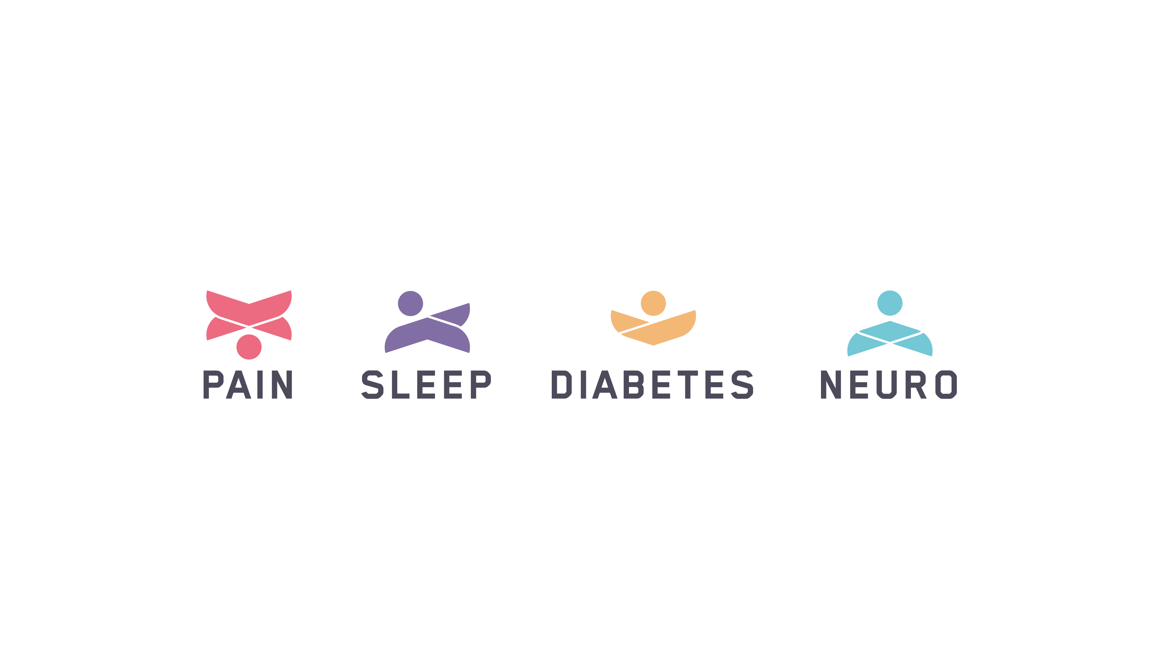
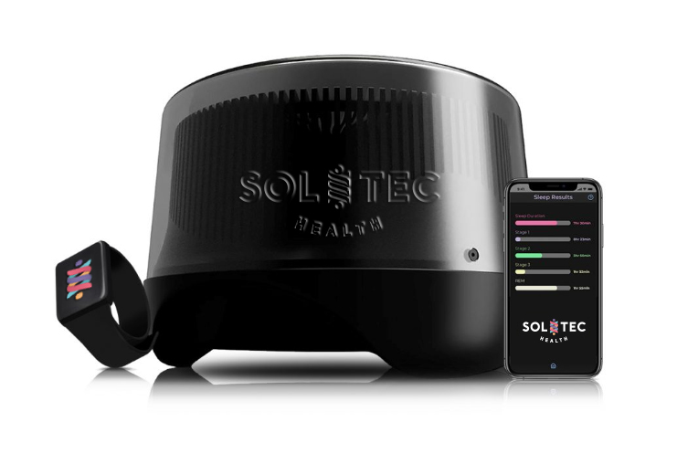
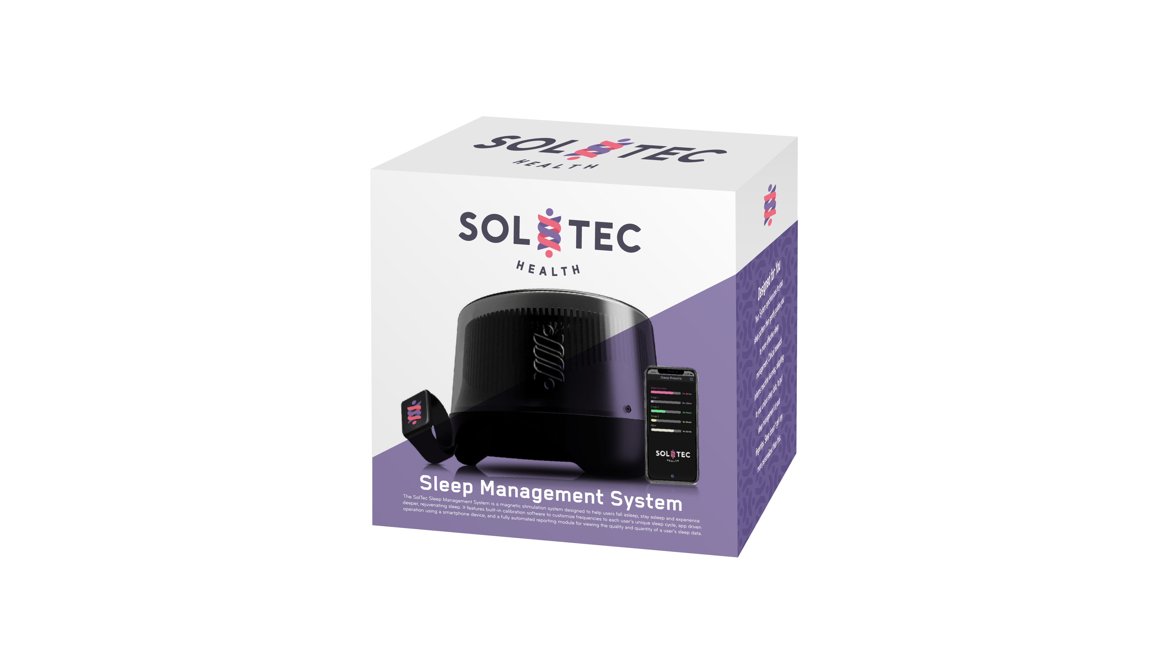
It was important for our design solution to communicate SolTec’s respect and reverence for humanity and those they serve. Their products and services are meant for everyone, no matter where they are in their lives, no matter their health. Their technology is easy to use, it’s effortless, it’s non-invasive, it’s uncomplicated so a sense of simplicity was also a critical characteristic to express.
Our Approach
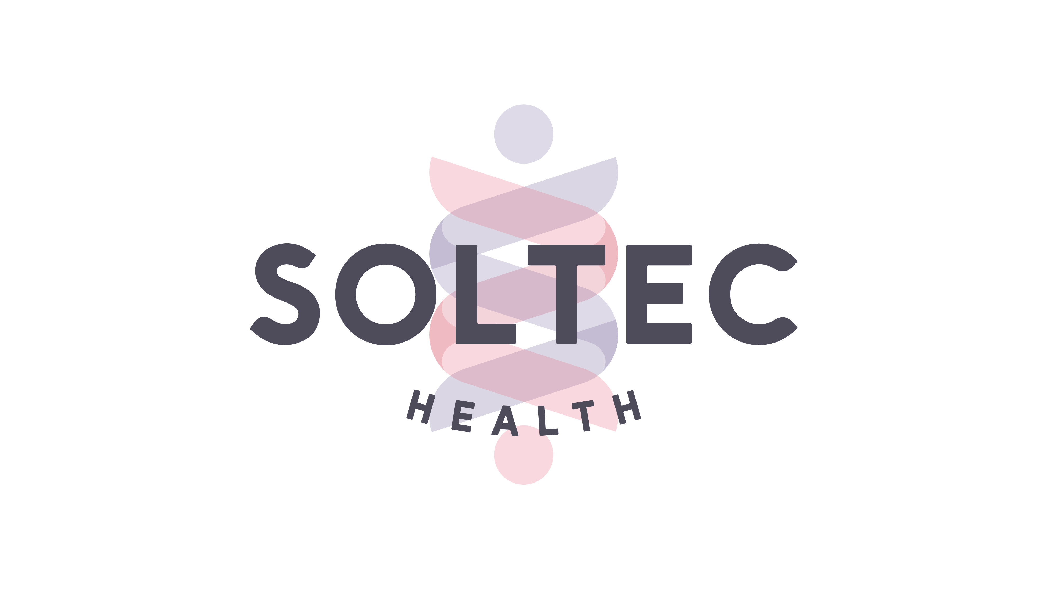
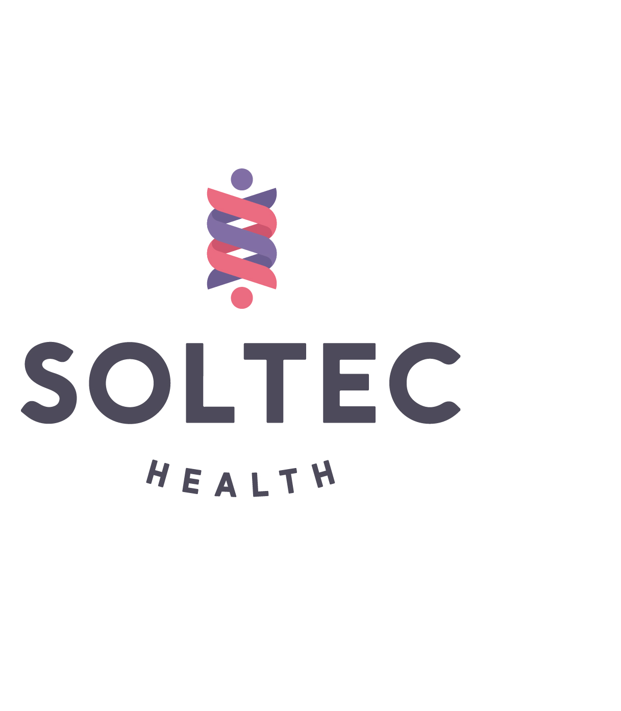
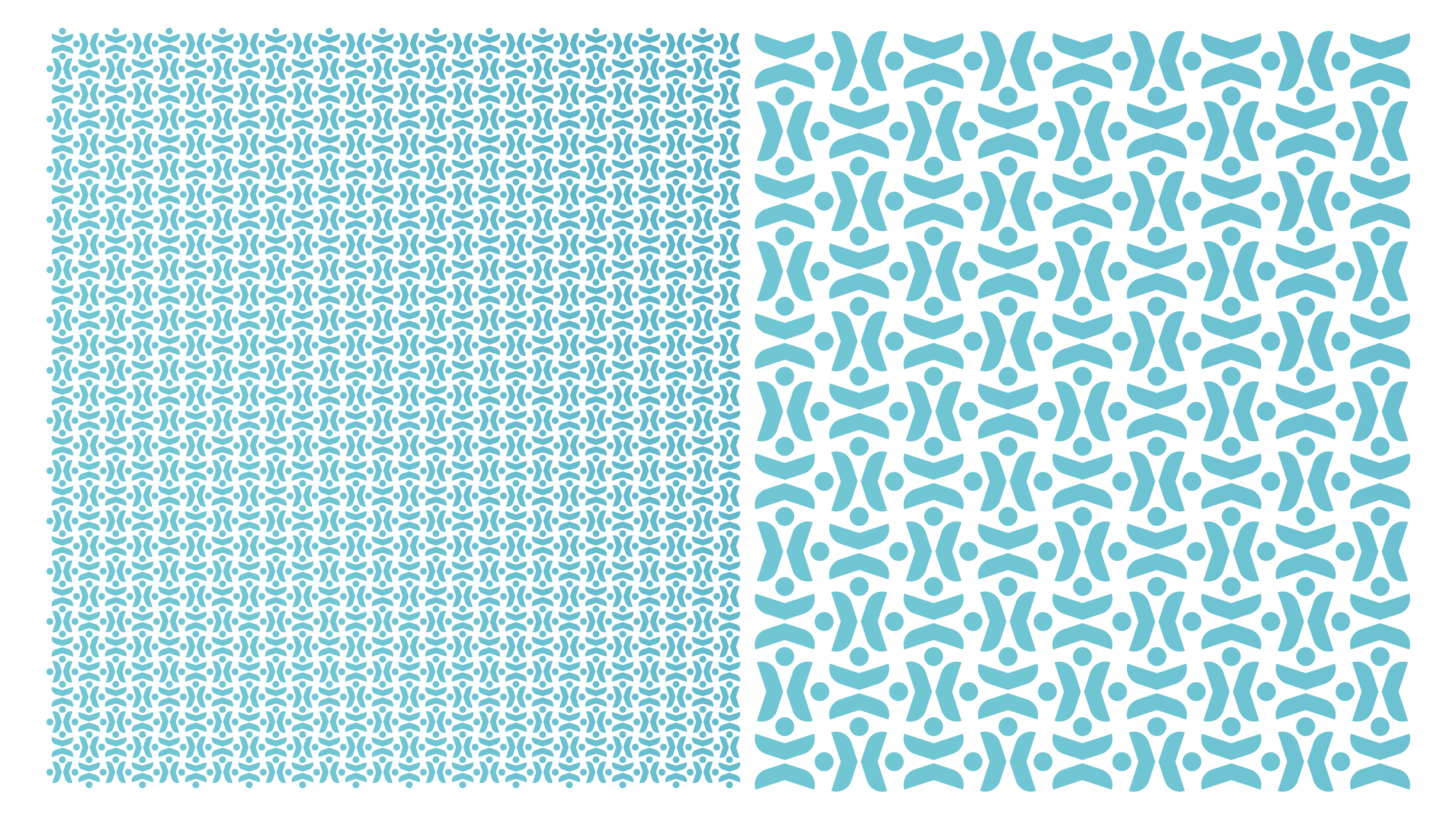
The suggestion of the DNA double helix strand represents the nature found in SolTec’s science and this suggestion also provided us with two opportunities: establishing the visual connection of SOL to TEC and inferring the transfer of energy from their technology to the human body. Harnessing the energy of the body’s own healing process inspires a bold and synergistic expression. The universal and anthropomorphic sensibility invites all to engage in delivering health to their whole self.
In Conclusion
SolTec Health’s mission is to bring to life scientific breakthroughs that enable millions of people to heal and lead fulfilling lives. Working with SolTec Health has enabled us to achieve our mission in harnessing the power of design to enrich everyday life.