McDonald's
McDonald's. Dessert. Happiness. The perfect trifecta.
- Brand Identity
- Brand Language
- Signage
- Menu Design
- Packaging
The Challenge
When dessert is the before, not the after
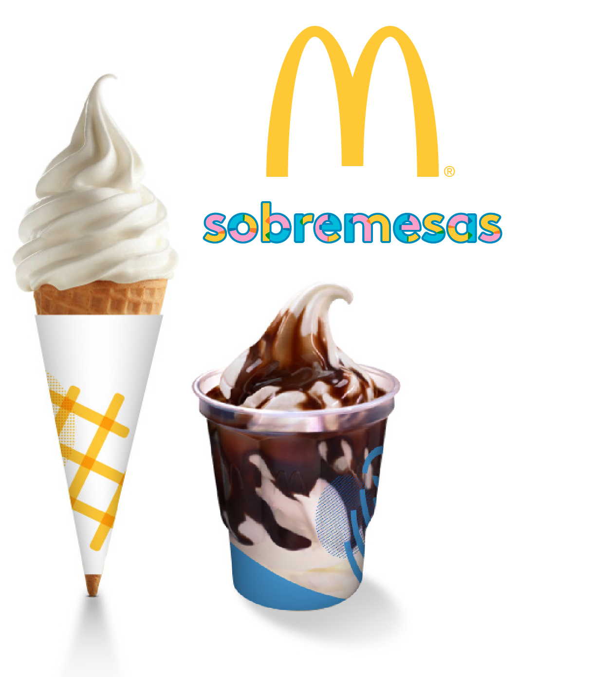
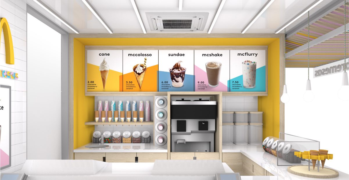
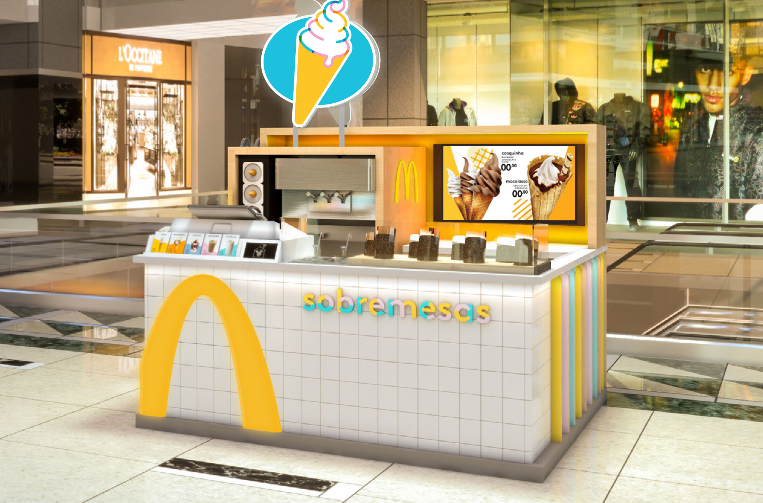
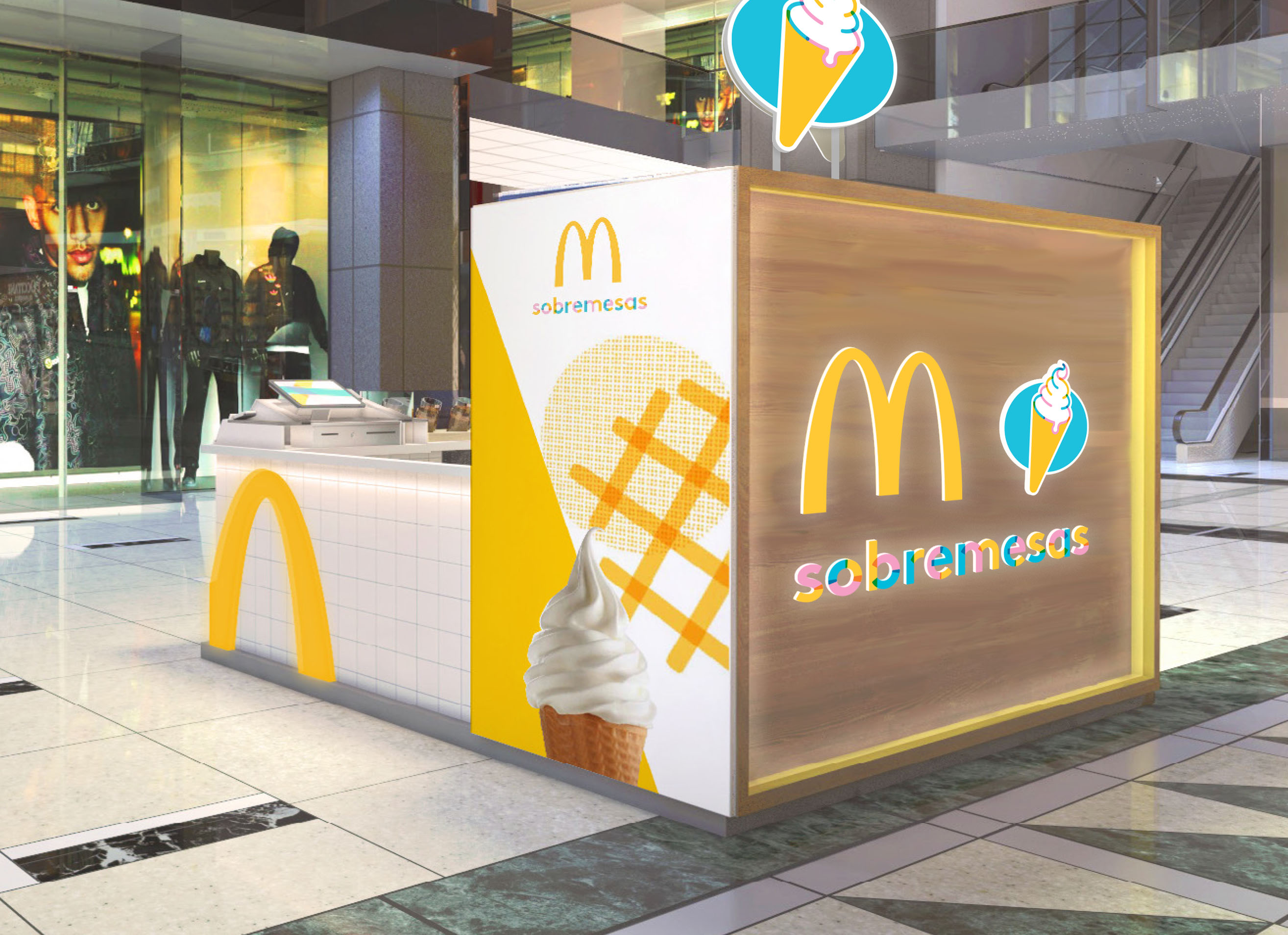
Our Duffy sweet tooth was delighted when our friends at McDonald’s asked us to collaborate with their architectural firm in designing free standing dessert kiosks. The purpose of the kiosk was to make it wonderfully convenient and fun for their guests to celebrate a little moment of happiness in their day. The launch of this new concept was in Brazil, a very sweet place to start.
The Solution
Dessert, a universal language
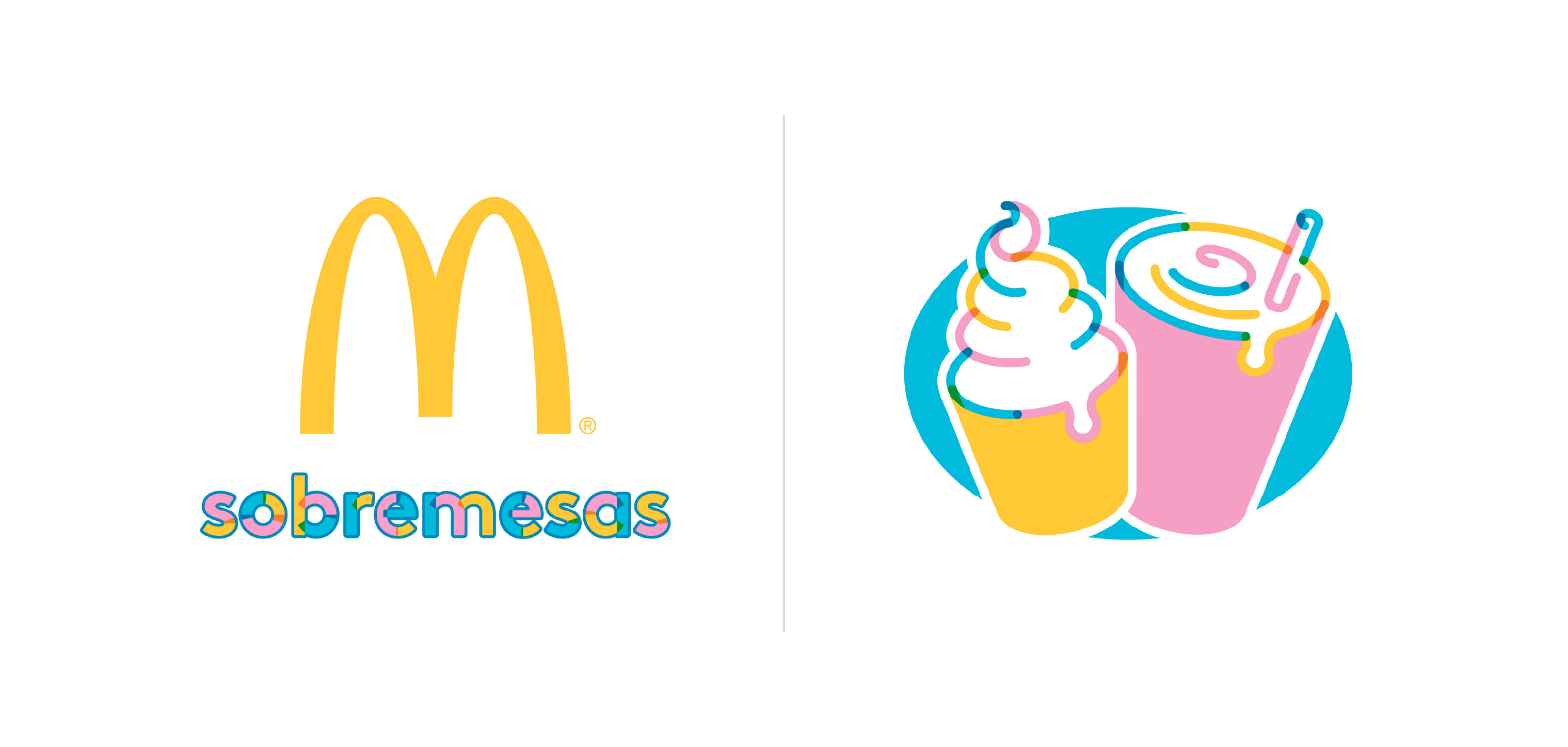
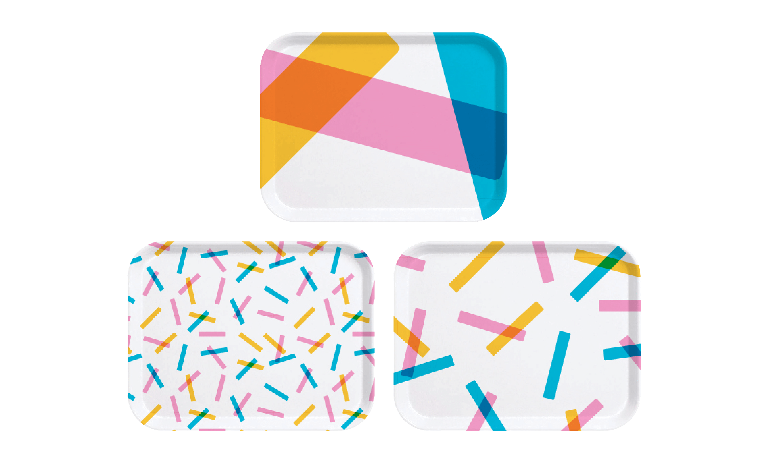
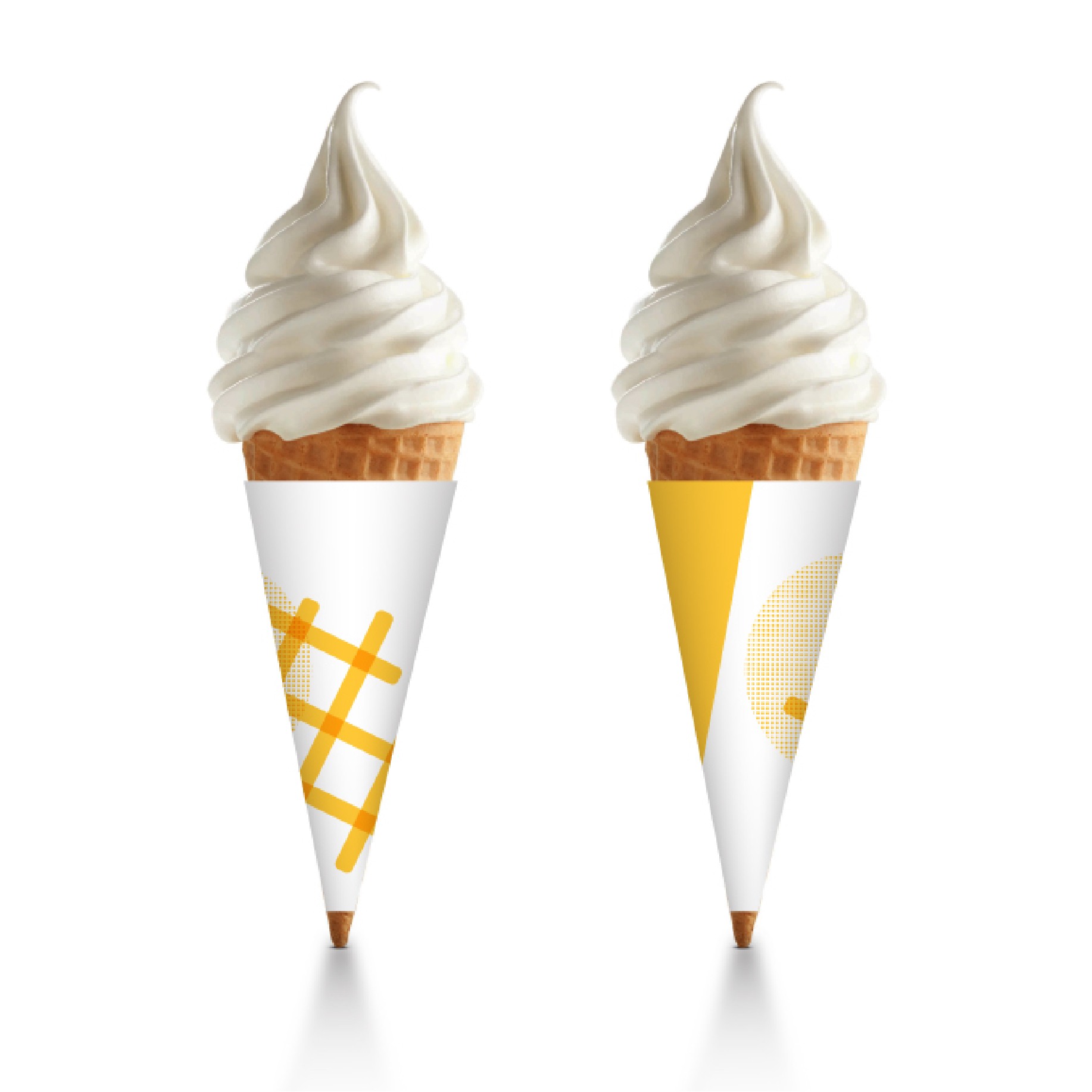
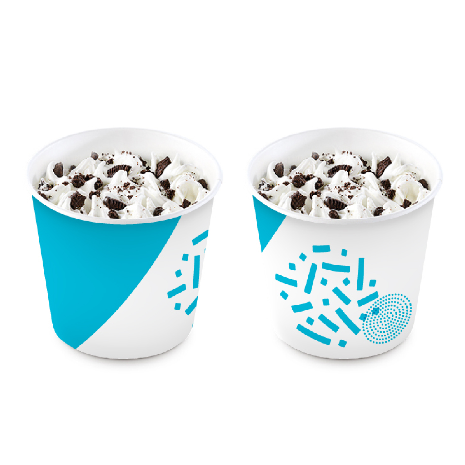
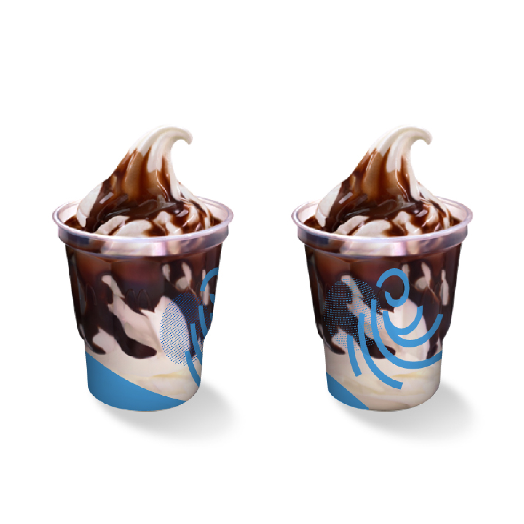
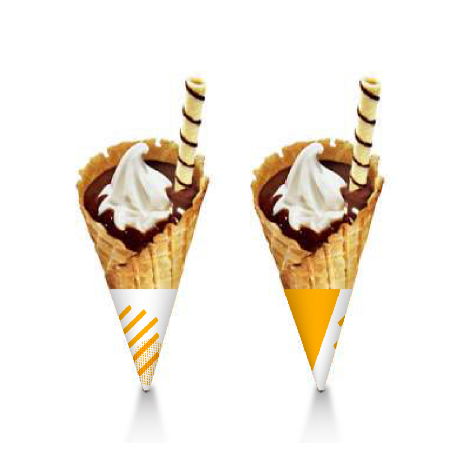
Our solution was inspired by the iconic visual expressions of McDonald’s ice cream dessert offerings. Swirls, waffle cones, sprinkles and a flurry of those beautifully blended flavors.



Our Approach
A Sprinkle of Happiness
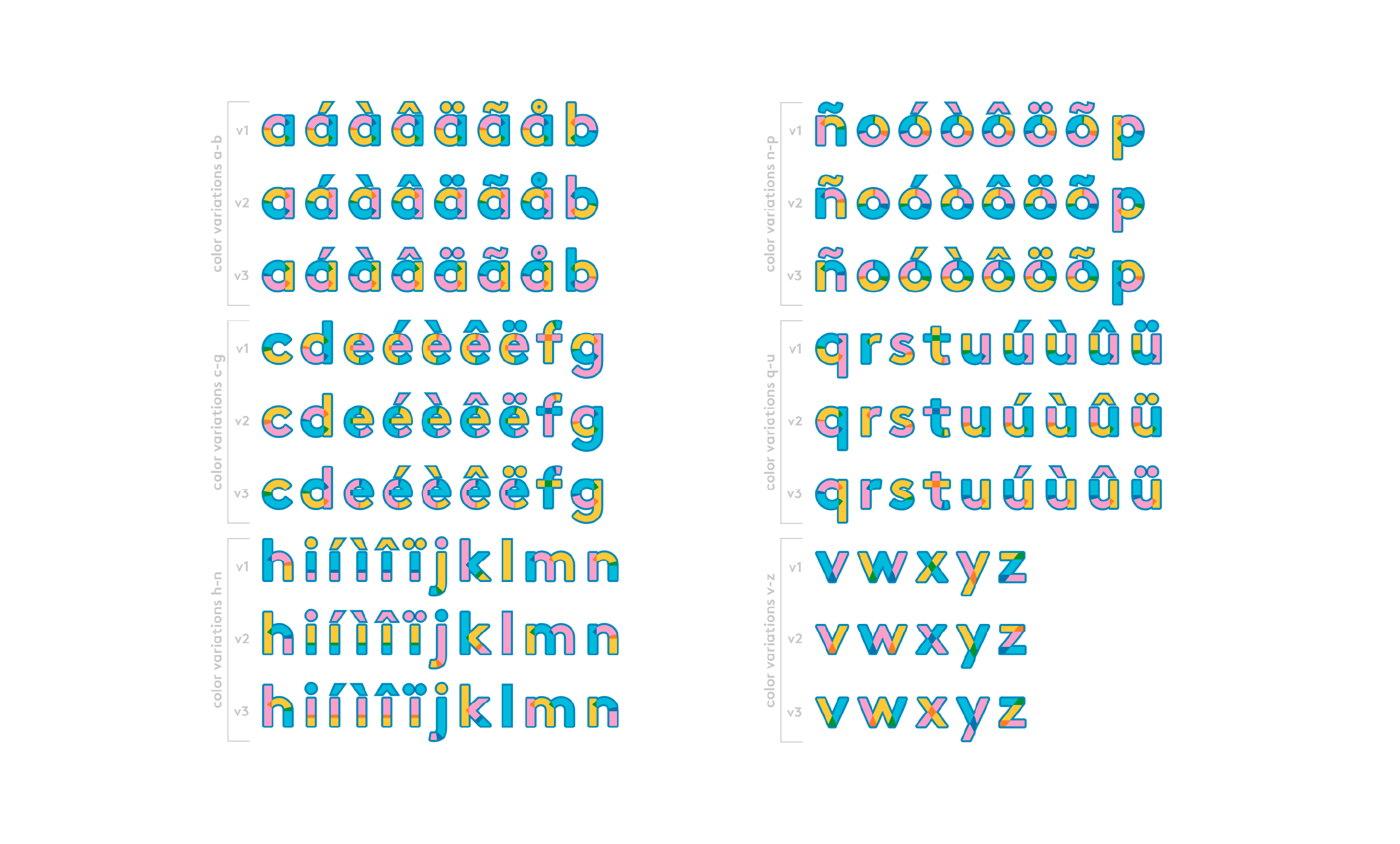
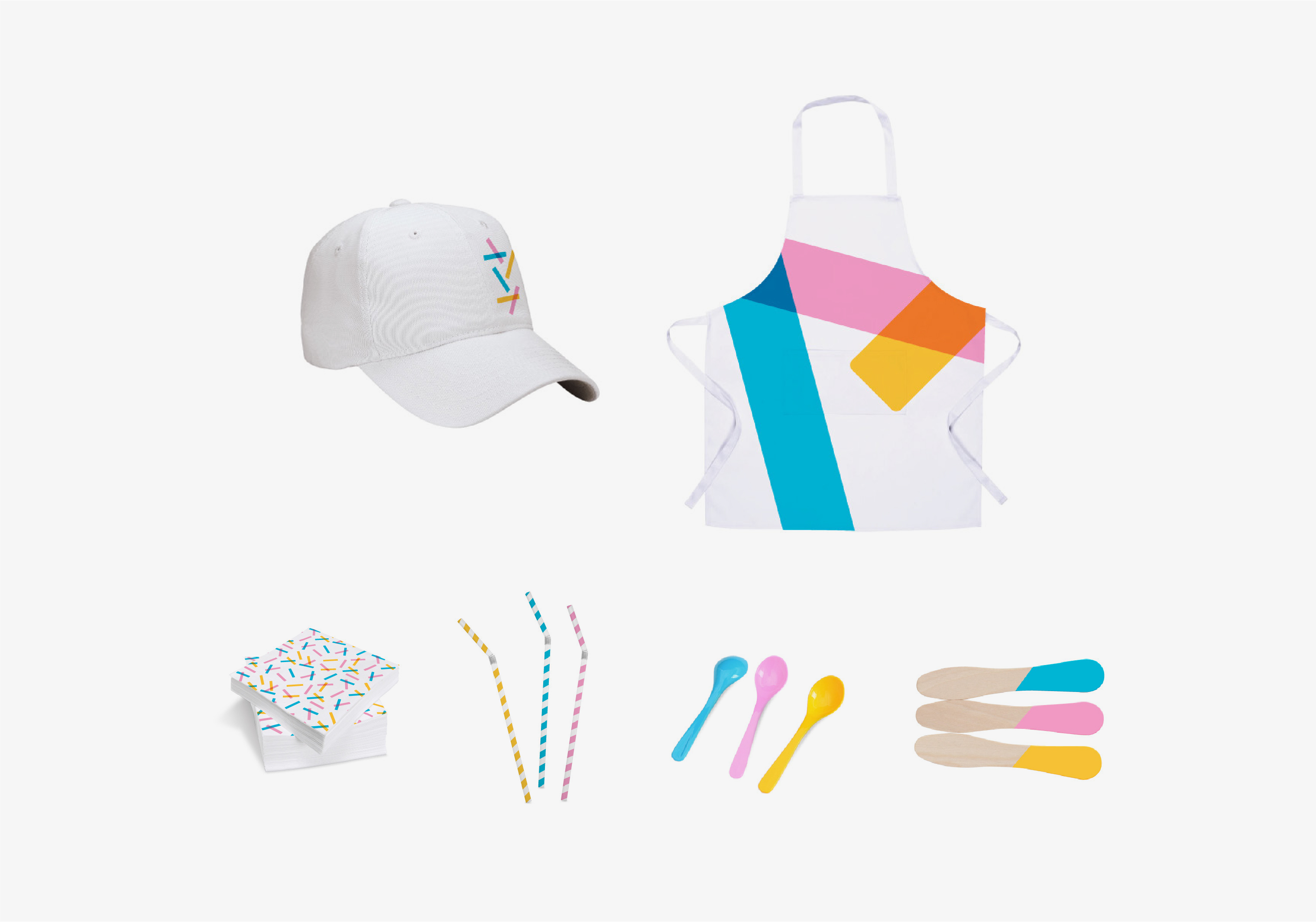
The iconic sprinkle shape became a unifying element and added a good dose of “happy.” It complemented the Golden Arches and provided a means for scaling color and unique application — from packaging to architectural detail. We created an alphabet so when this concept is introduced around the world, in multiple languages, the brand is consistently represented.
In Conclusion
You know that craving you get for a McDonald’s cone? Well that craving, along with McDonald’s commitment to delivering a little happiness in your day, inspired this dessert celebration.
