Prairie Organic Spirits
Showing True Spirit
- Brand Revitalization
- Brand Architecture
- Packaging
- Bottle Design
The Challenge
It's all about the story, but you have to tell it.
When the folks at Phillips Distilling Co. came to us they asked us two things:
“Our Prairie Organic Spirits brand is a bit too boutiquey and we feel it should be a little more approachable. Prairie is for everyone, can you help us communicate this?”
“Ours is a Farmer’s story, will you help us tell it better?”
We said, “it would be our great pleasure.”
The Solution
Grit and Craft
Prairie Organic Spirits take three years to make. Their competitors make their spirits in three hours. The commitment to sustainability is a central ingredient in these smooth and wonderful tasting spirits. It takes the true grit of the soil and the perseverance of the farmer to grow the corn. It takes the craftsmanship of the distiller to ensure that the integrity of the grain shines through. The familiarity of “farm to table” was a leverageable mindset and part of the cultural vernacular. Those managing the Prairie brand understood this and to better tell their story, they entitled it, “Seed to Bottle.”
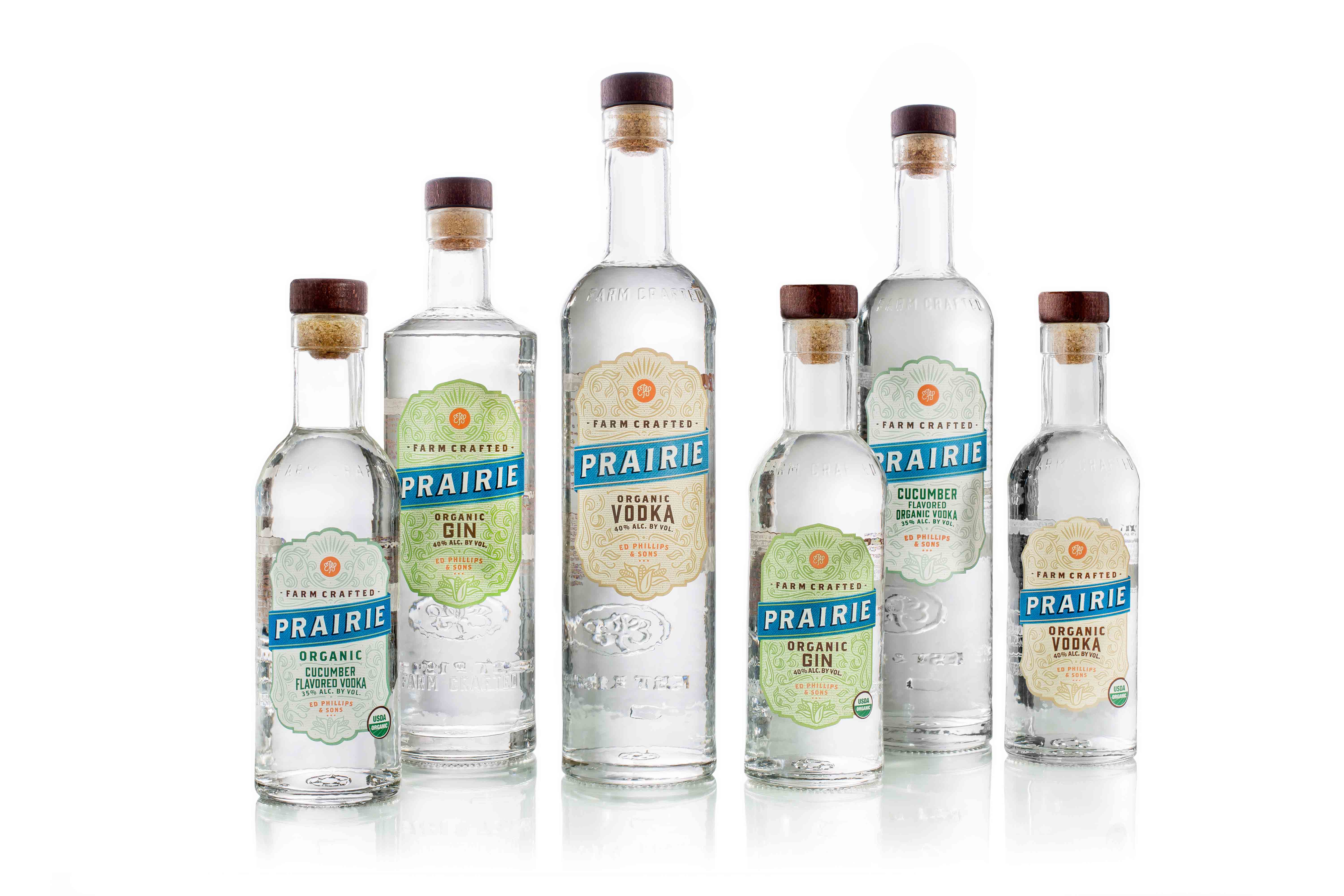
This truth became the inspiration for the brand’s evolution. The organic innovation at the heart of the brand also inspired the development of new products such as Prairie Gin and Prairie Cucumber Vodka. As we evolved the brand’s expression we created an architectural framework to keep the brand consistently imaginative.
Our Approach
Seed to Bottle
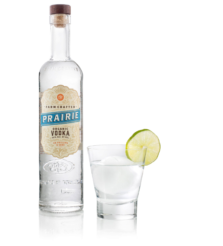
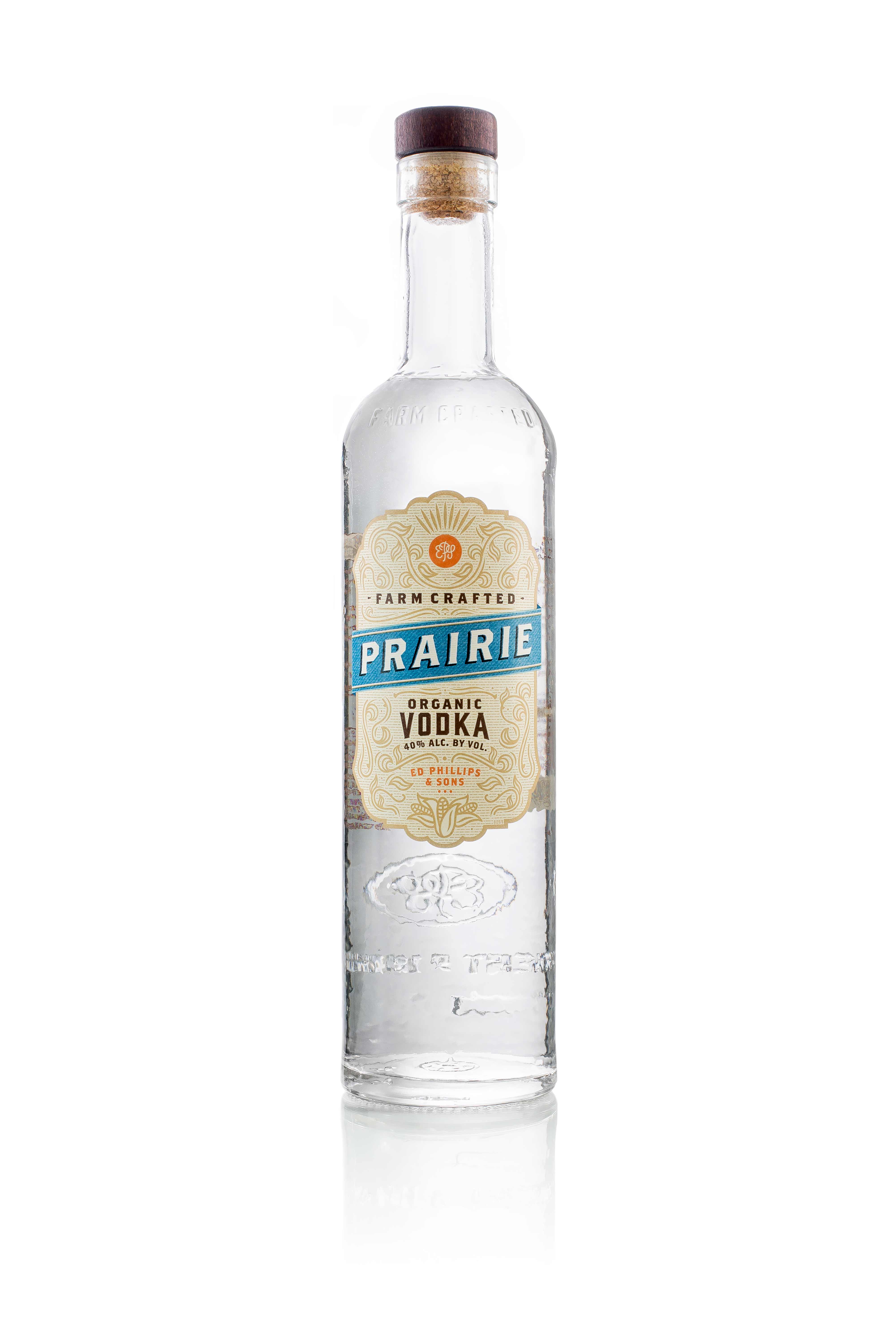
Prairie wildflowers, grasses and a vintage sensibility were reflected in the brand’s original design. The original thin, tall and top heavy bottle posed problems on shelf. It situated the brand closer to the expected Vodka and Gin packaging and was appealing, perhaps, more to women than men. Overall, the brand expression was too polished and the organic grit and craftsmanship were lost. Even so, the brand had earned hard fought equity and it was our job to harness that equity in the evolution.
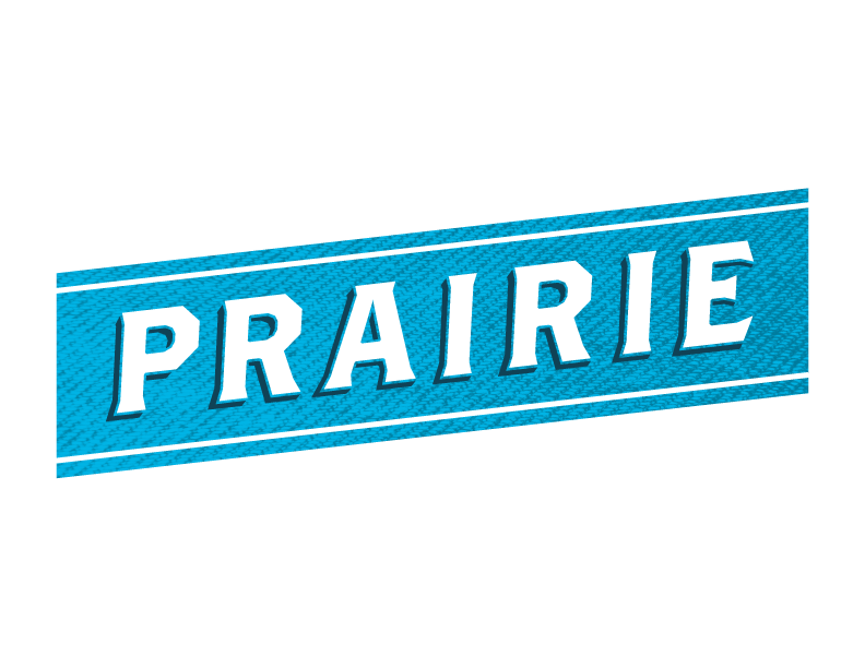
We simplified the label design and selected a more natural color palette while extending it knowing that the brand would grow as new innovations were developed. The Prairie blue banner evolved to a denim expression, noteworthy of the worn denim on the farmers growing the corn. We enhanced the hierarchy of the communication and added “Farm Crafted” to the label as this is the brand’s truth. We connected “Organic” to the description of the spirit so that this claim didn’t seem to be an add on.
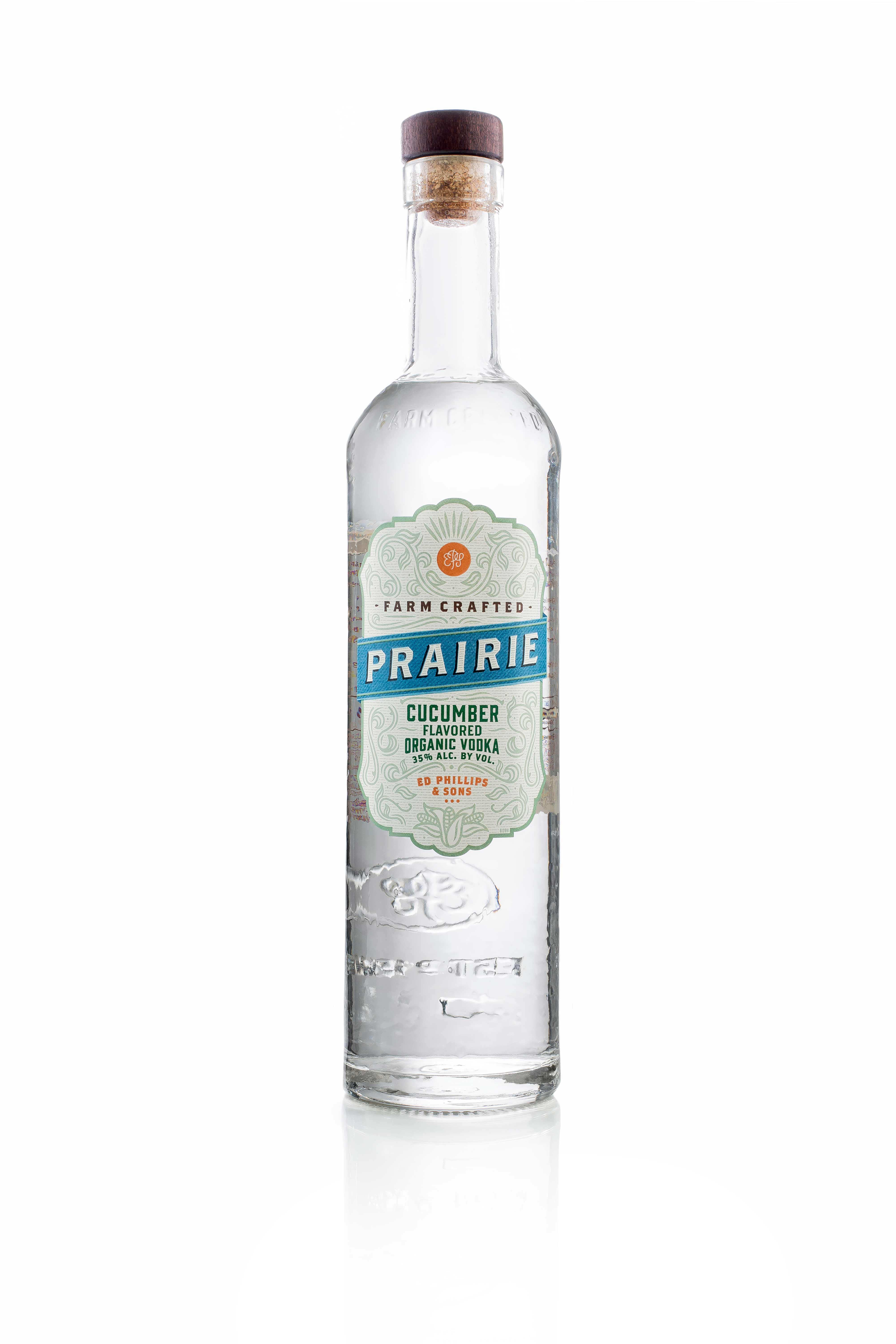
The hallmark of the new expression was the design of a new bottle. The new bottle shape remedied the brand’s problem at shelf and the hammered texture of the glass is suggestive of the grit in organic farming and the craft in craftsmanship. The “Farm Crafted” type is also embossed into the glass, reinforcing the brand’s truth and the new wooden cork closure was the perfect way to top off this new bottle.
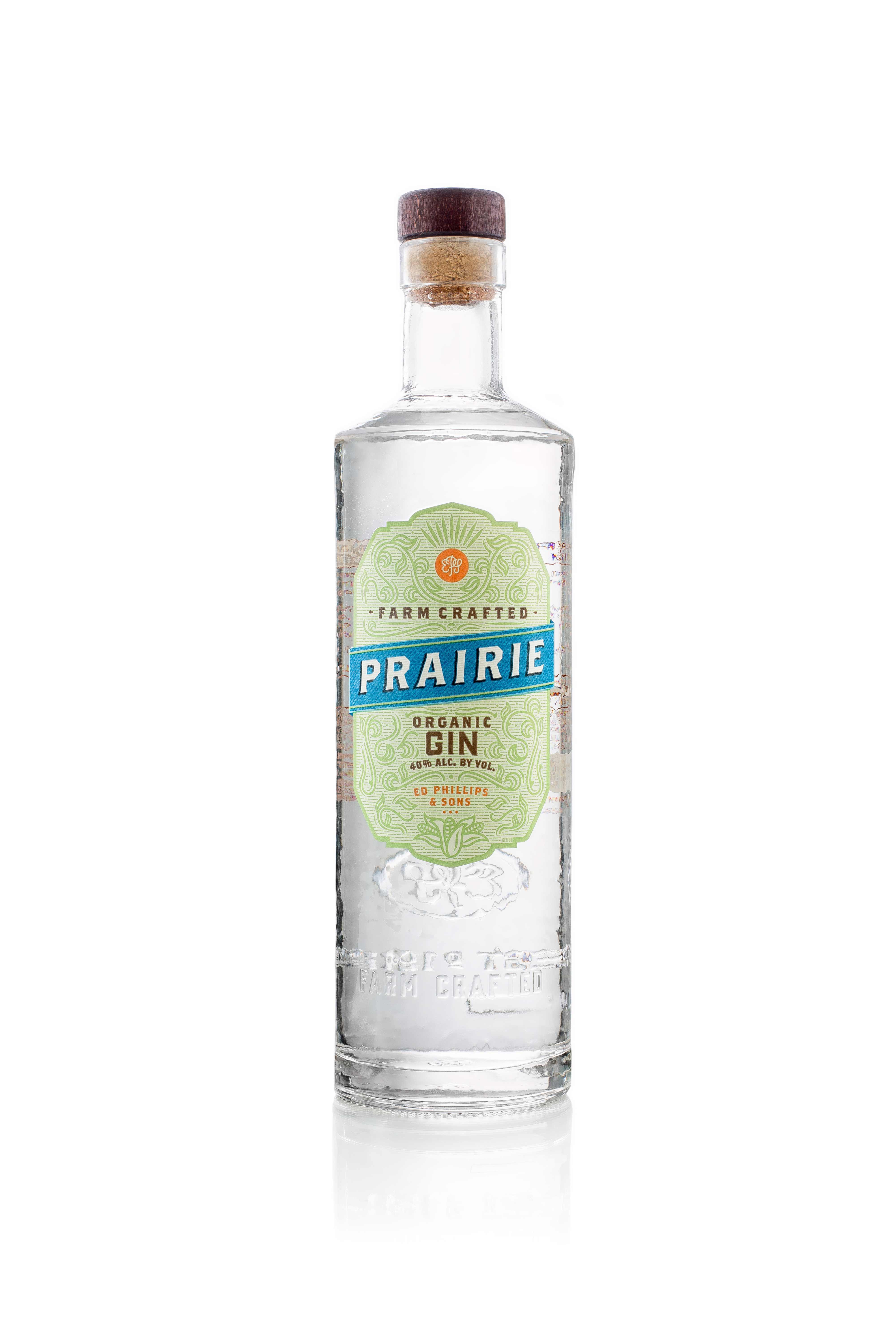
We differentiated the Gin bottle from the Vodka bottle, in height and shoulder slope, to help the shopper see the difference and in so doing, helping them to realize the brand’s varietal offering.
In Conclusion
“For the past decade, we’ve developed strong relationships with local family farmers who work meticulously to meet high certified-organic standards. We wanted the spirit of this work ethic and our farm-crafted commitment represented in the new custom hammered bottle design. We’re also proud of the way our new bottle showcases Prairie Organic’s award-winning quality, and are confident this new look will help strengthen our presence in key retail environments.”
Vice President of Marketing