Mall of America
Brand equity inspires brand ingenuity
- Identity
- ARCHITECTURE
- BRAND LANGUAGE
- MESSAGING
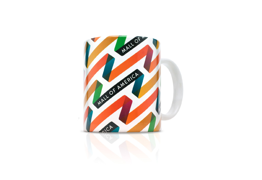
- BUSINESS SUITE
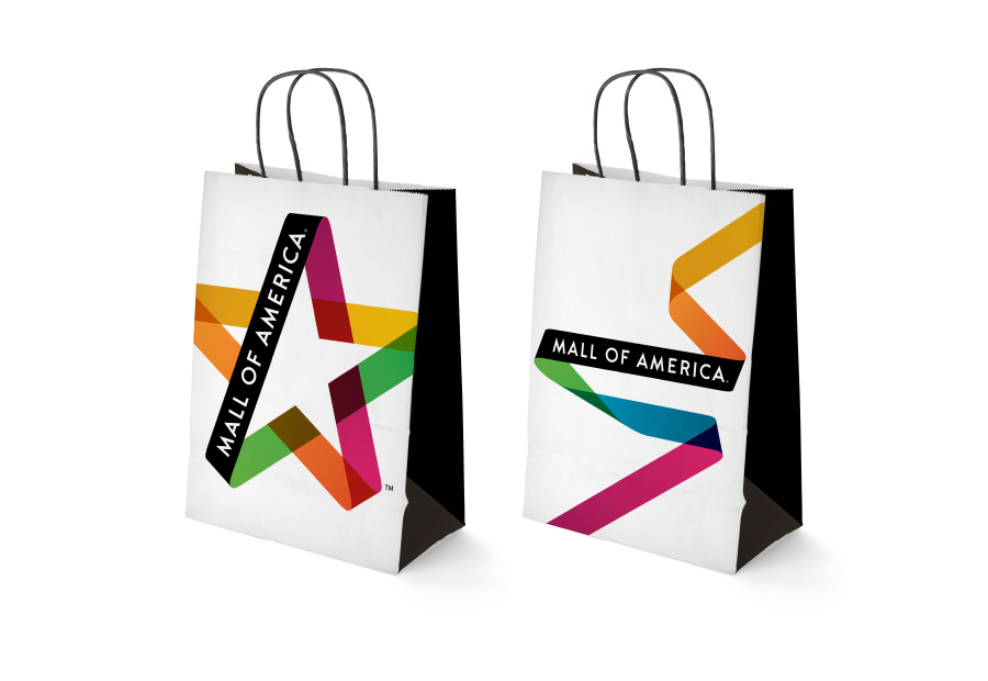
- PACKAGING
- PROMOTION
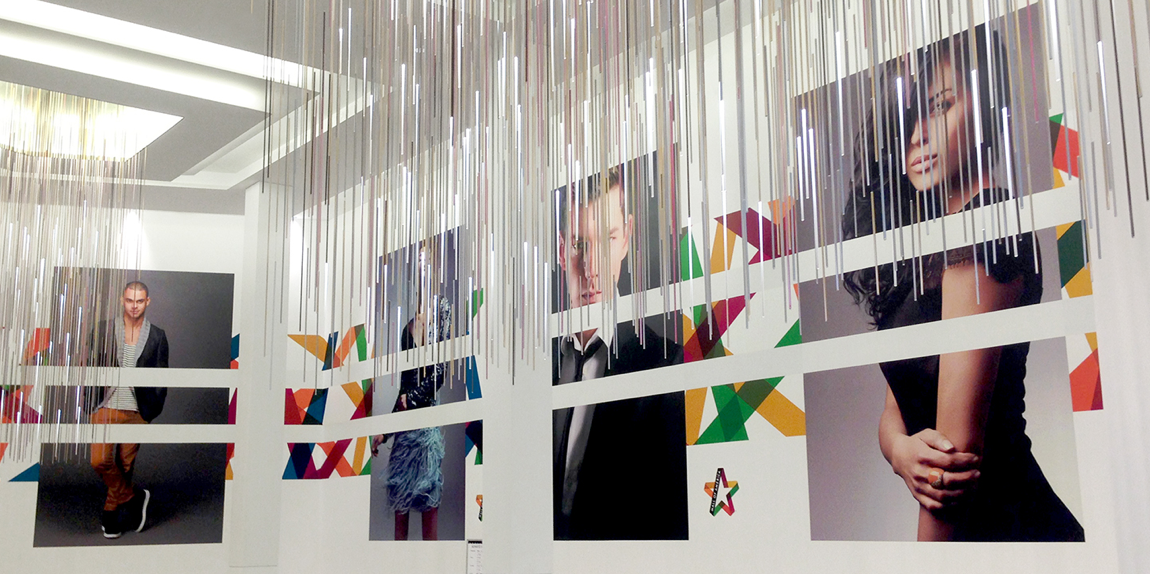
- ENVIRONMENT
The Challenge
MAKING OLD NEW AGAIN
Upon its 20th anniversary, the world’s largest retail complex was in search of a new identity—something that would better reflect its position as a curator of popular culture. With 40 million visitors crossing the Mall’s threshold each year, the stars and stripes identity had become as iconic as the mall it represented, yet the two were out of step. The mall had evolved, but the identity was stuck in the past. As one of the most recognized brands in the world, it was our job to make sure this “bucket list” destination somehow honored its beloved stars and stripes while aligning with the continually evolutionary entity that is the Mall of America.
the solution
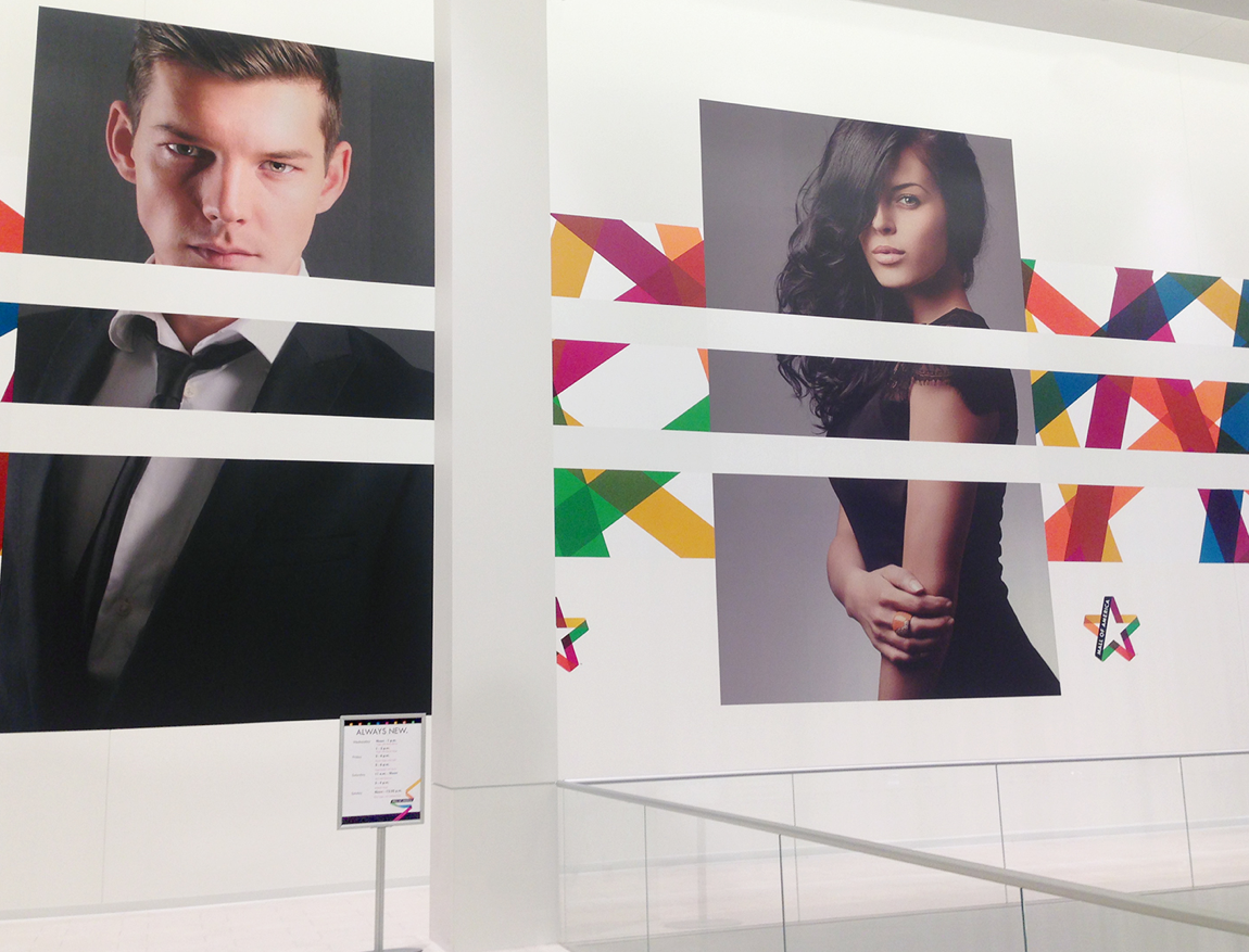
ALWAYS CHANGING, ALWAYS NEW.
To convey the dynamic nature of an environment that keeps in-sync with the pulse of American culture, we knew our solution had to be as dynamic as the Mall itself.
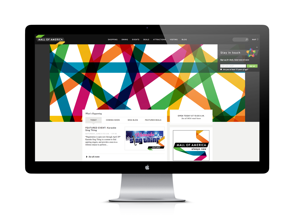
DYNAMIC IDENTITY. DIGITAL CONTINUITY
An identity is more than a logo, it is the sum total of all communications. At the heart of all brand communication lives the website where brand language elements serve as navigational assets and so much more.
our approach
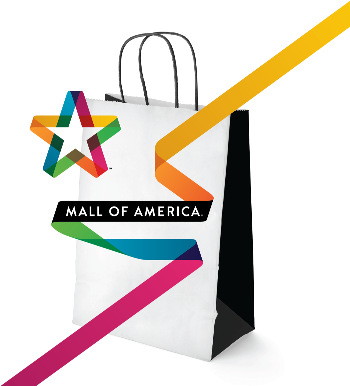
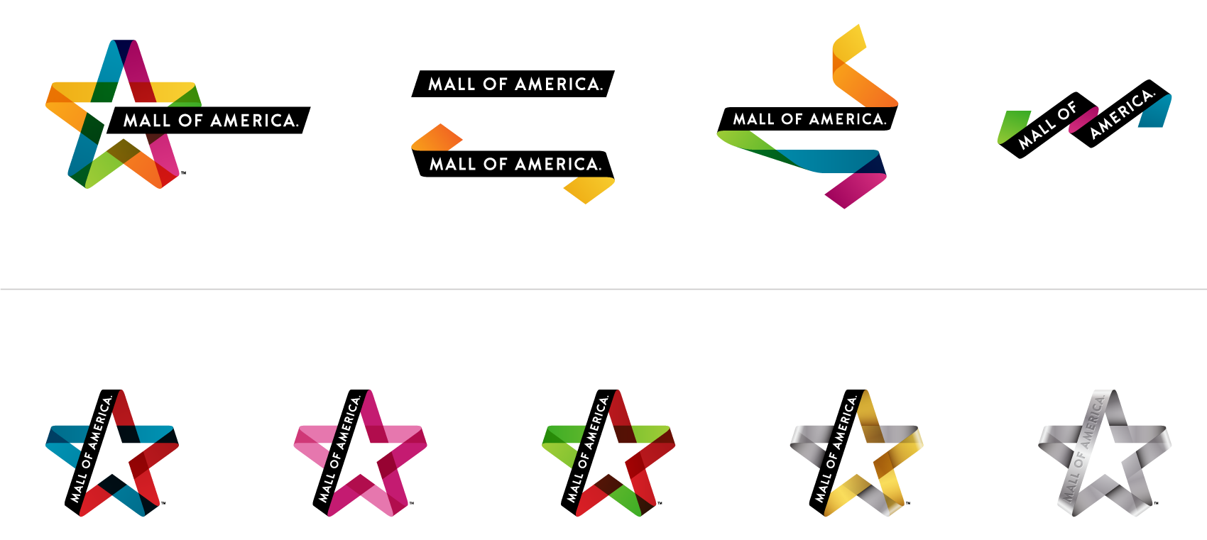
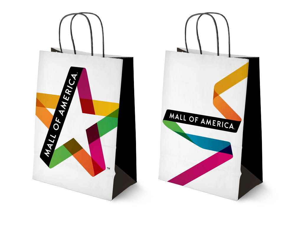
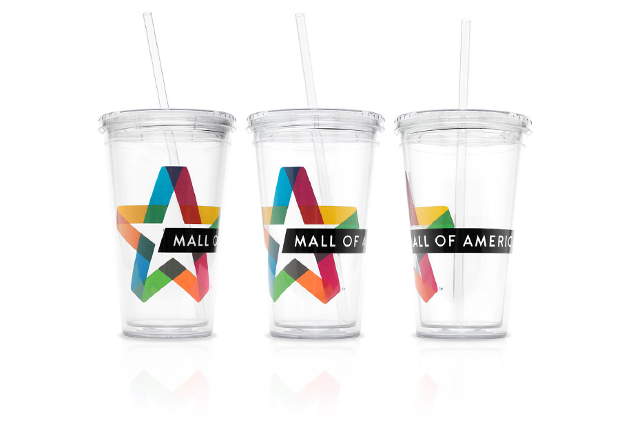
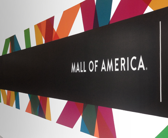
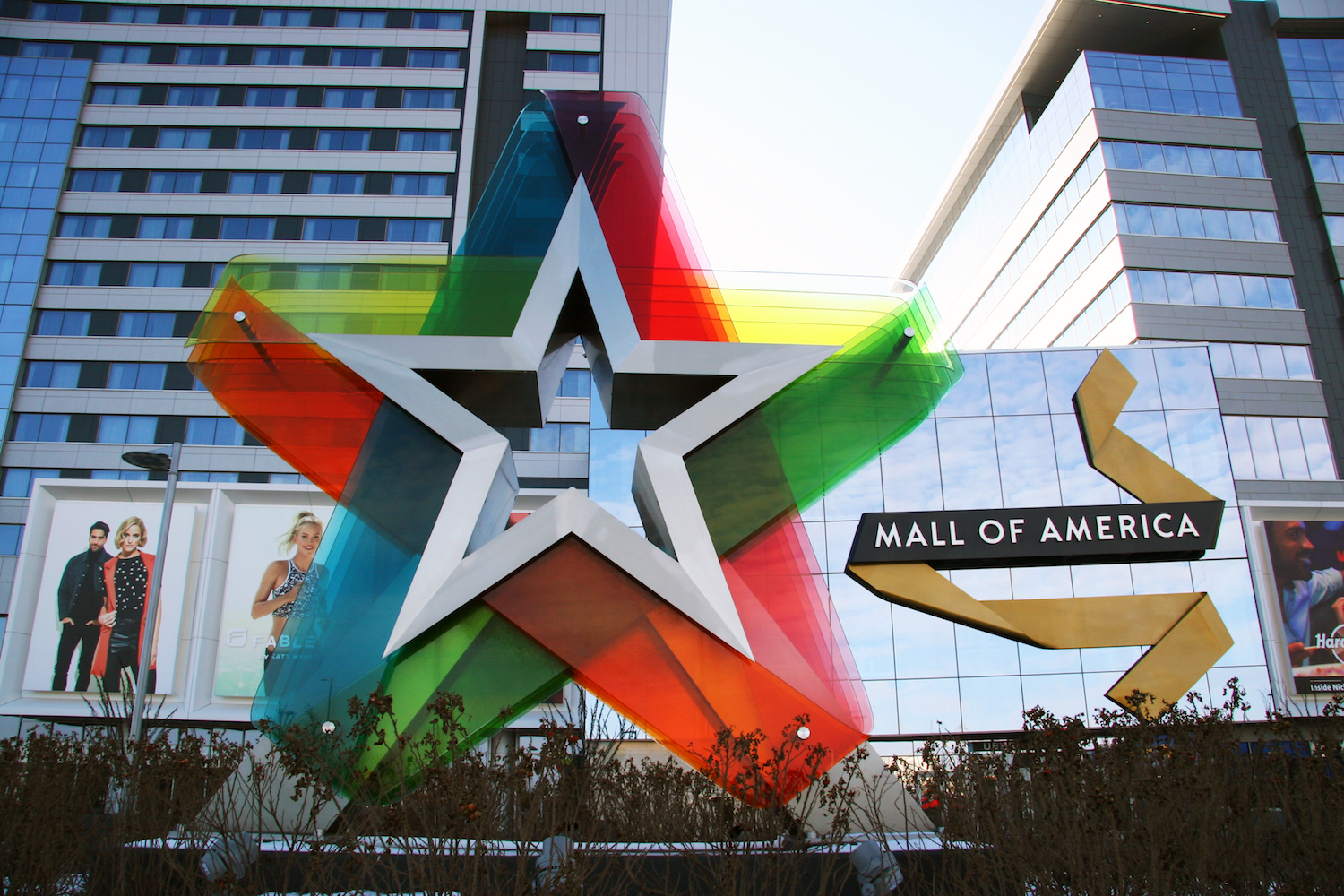
A RIBBON OF POSSIBILITIES
The creative approach to this dynamic identity was to activate this brand’s most equitable asset, it’s logo. Banners became ribbons framing the star — the Mall — and convey the always changing nature of the Mall of America experience. The ribbon in a sense represents the imagination and magic found in stores, theaters, cuisine, amusements and in the unity found in hosting community events. The star and ribbon forms remain constant while dynamically functioning to communicate holidays, events, offerings and much more. Our approach had to be as experiential as the Mall itself.
DESIGN TO EXPERIENCE
If ever there was a solution that demonstrates the power of a brand language, it’s this one. The power of a visual language emanating from the iconographic Mall of America logo creates a brand imprint that connects and creates an undeniable design experience.
Credits:
Tony Coleman Architects
In conclusion
Always new
Maureen Bausch, Executive Vice President of Business Development said: “Mall of America is never static. Our challenge was to create an identity to reflect the dynamic experience of MOA. Far more than a logo, Duffy designed a ‘living’ brand with the ability to evolve as Mall of America grows… always new.”