Caribou Coffee
Creating Shelf Presence with Coffeehouse Heritage
- Brand Language & Architecture
- Packaging
- Promotional Merchandise
The Challenge
Iconic Challenger
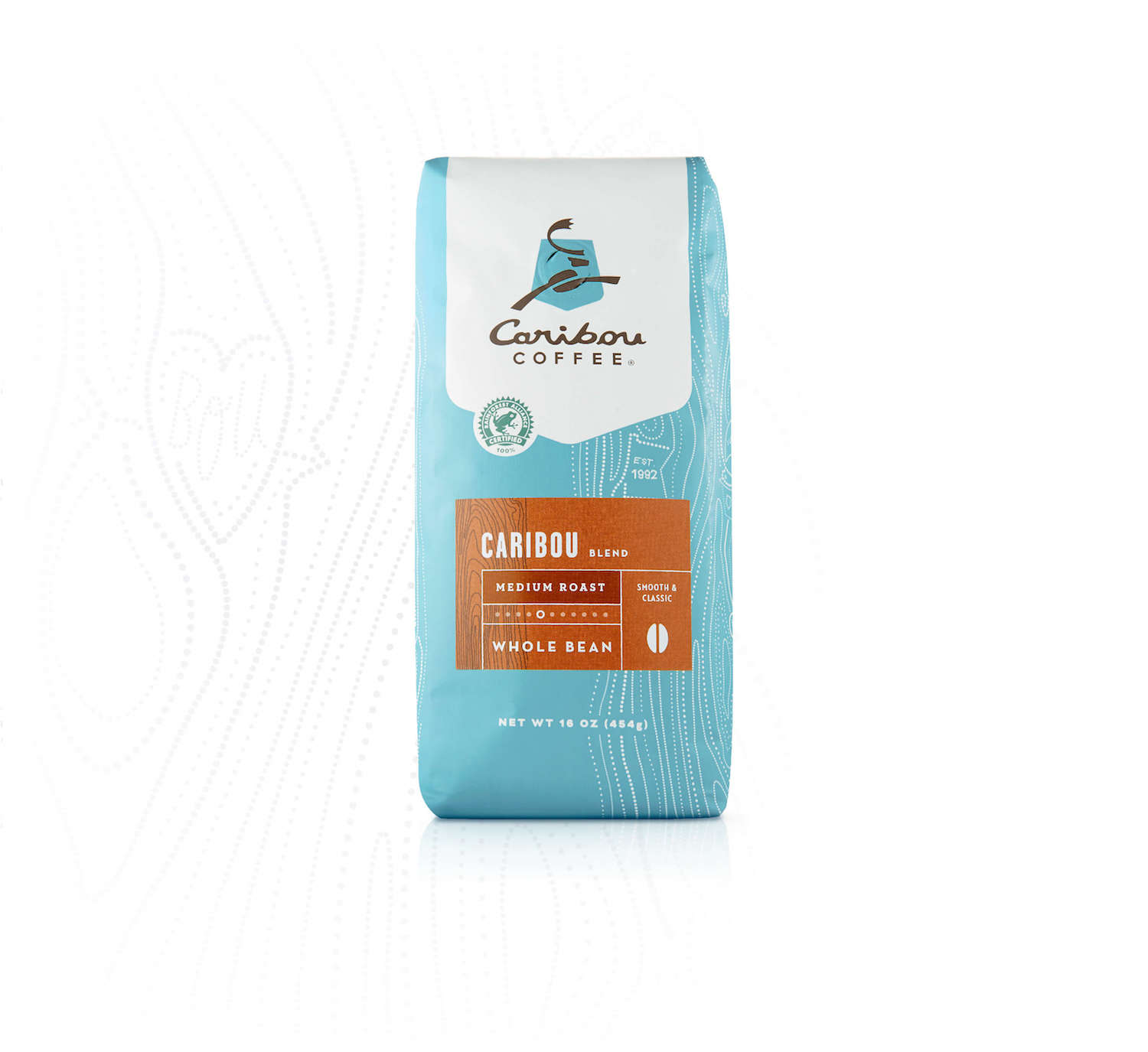
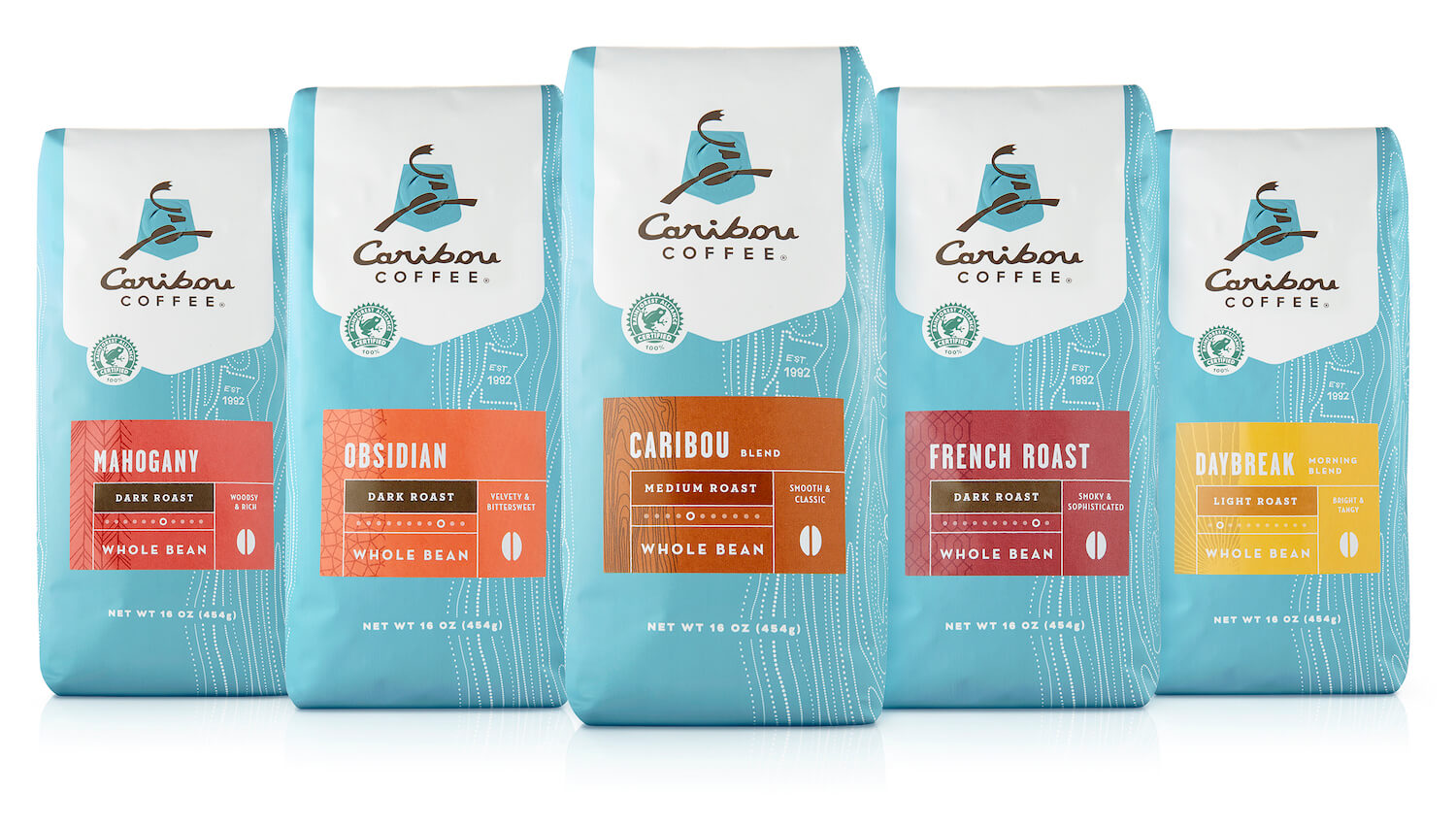
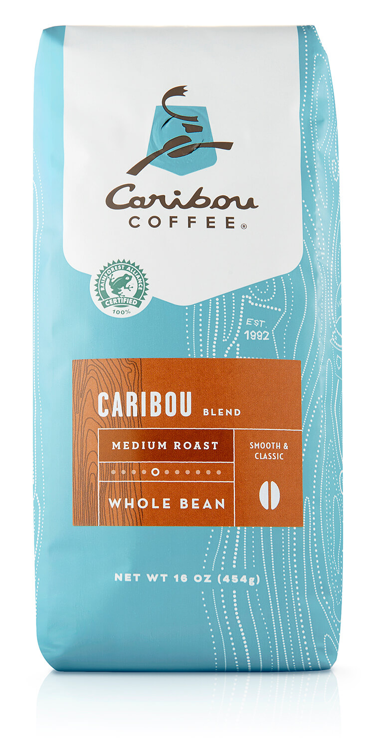
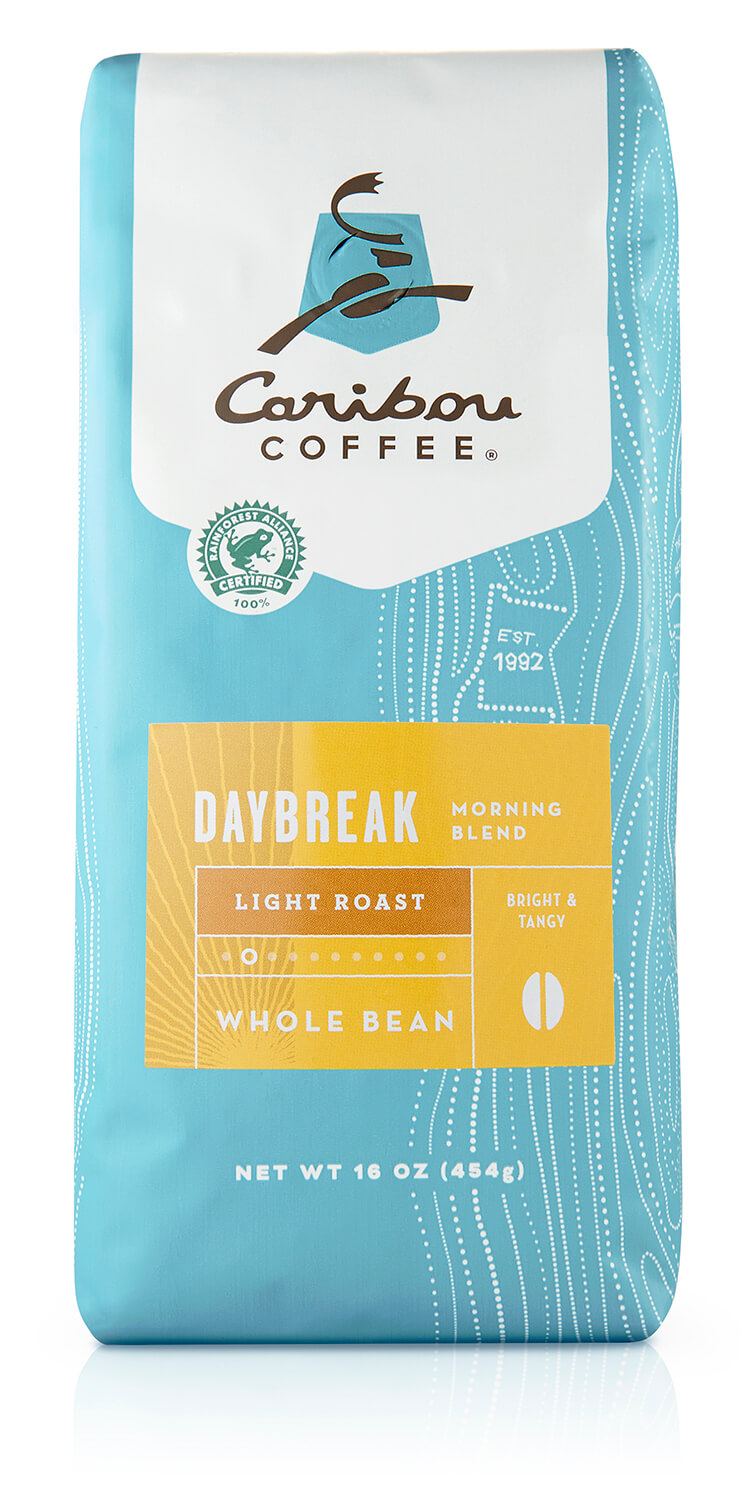
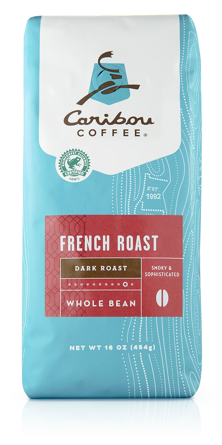
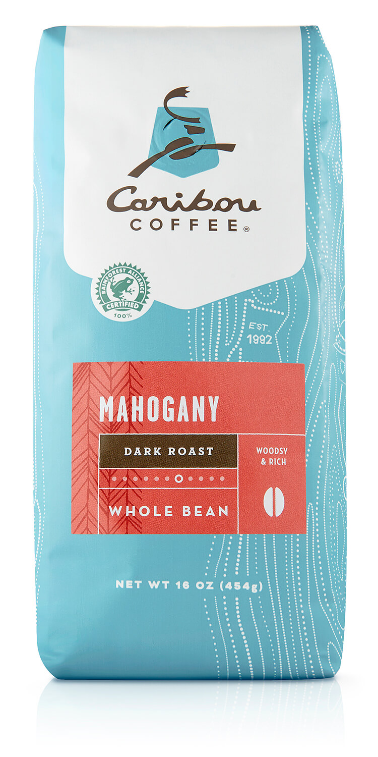
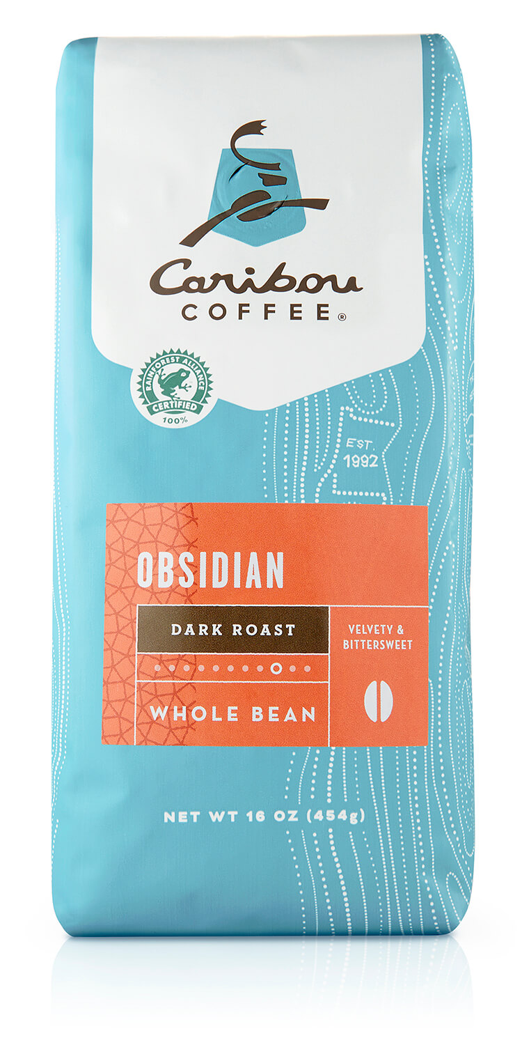
Like any good challenger, the folks at Caribou Coffee wanted to disrupt the coffee aisle in order to be seen, “heard,” and purchased. The other hundreds of coffee bean packages in the same aisle were designed to achieve those exact same results. What was Caribou to do? The answer was obvious, to be true blue.
The Solution
Turning Moments into a Movement
Caribou’s desire to help people make the most of every moment had given way to an introspective expression on shelf. Quipping about quiet moments of reflection, or those moments when you realize life is just too short, had become an expression of many words, words that were getting lost in the pack’s beige burlap-esque backdrop. This made it difficult for the shopper to navigate the brand. With the Caribou team, we made the decision to go bold. Pump up the vitality and energy of their playful, quirky personality and double-down on their passion for delivering premium coffee. This emboldened passion is what drives the Caribou movement. A movement born from one exhilarating Alaskan mountaintop moment inspiring the founders to create Caribou Coffee.
Our Approach
An Authentic Wink
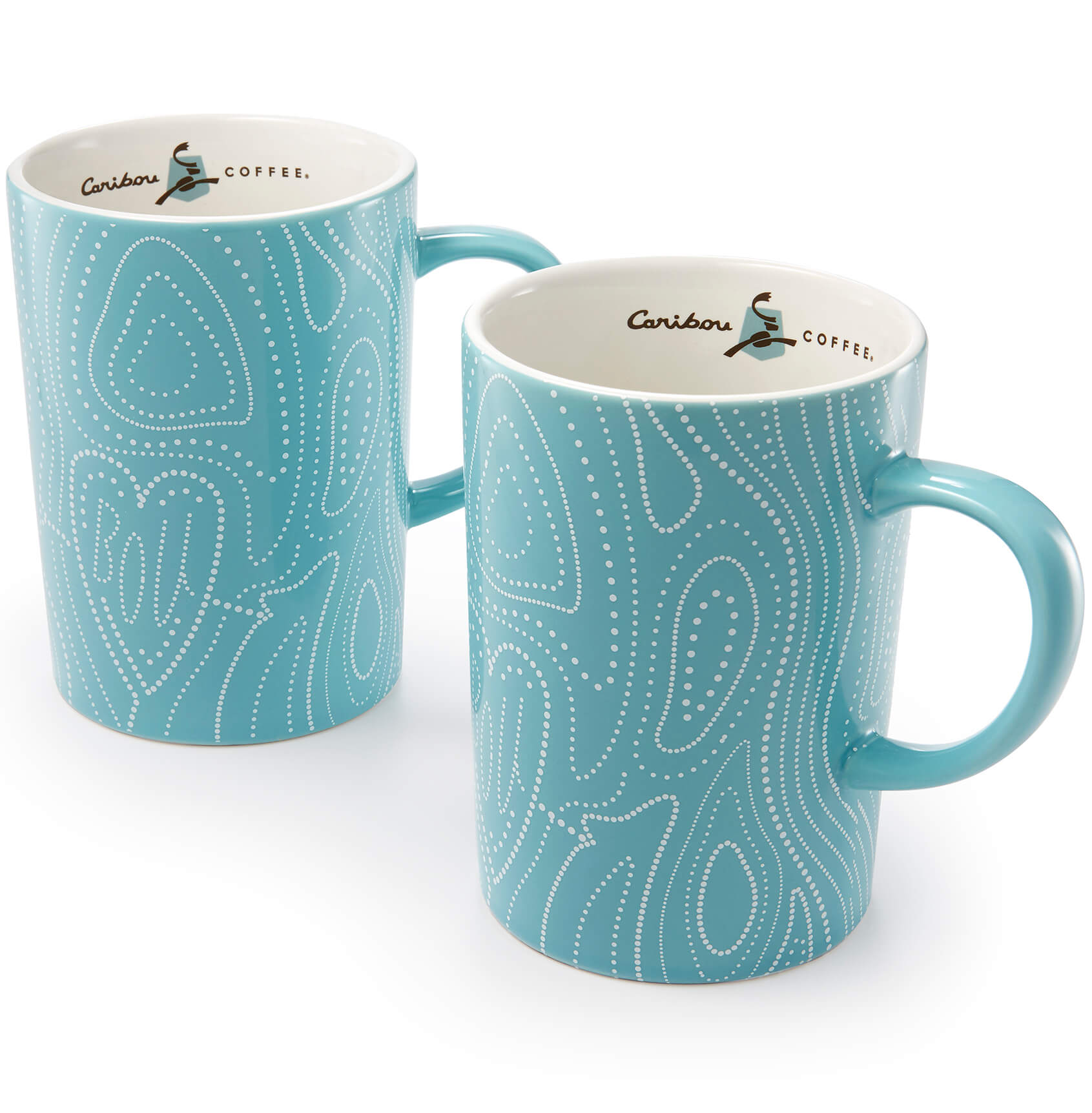
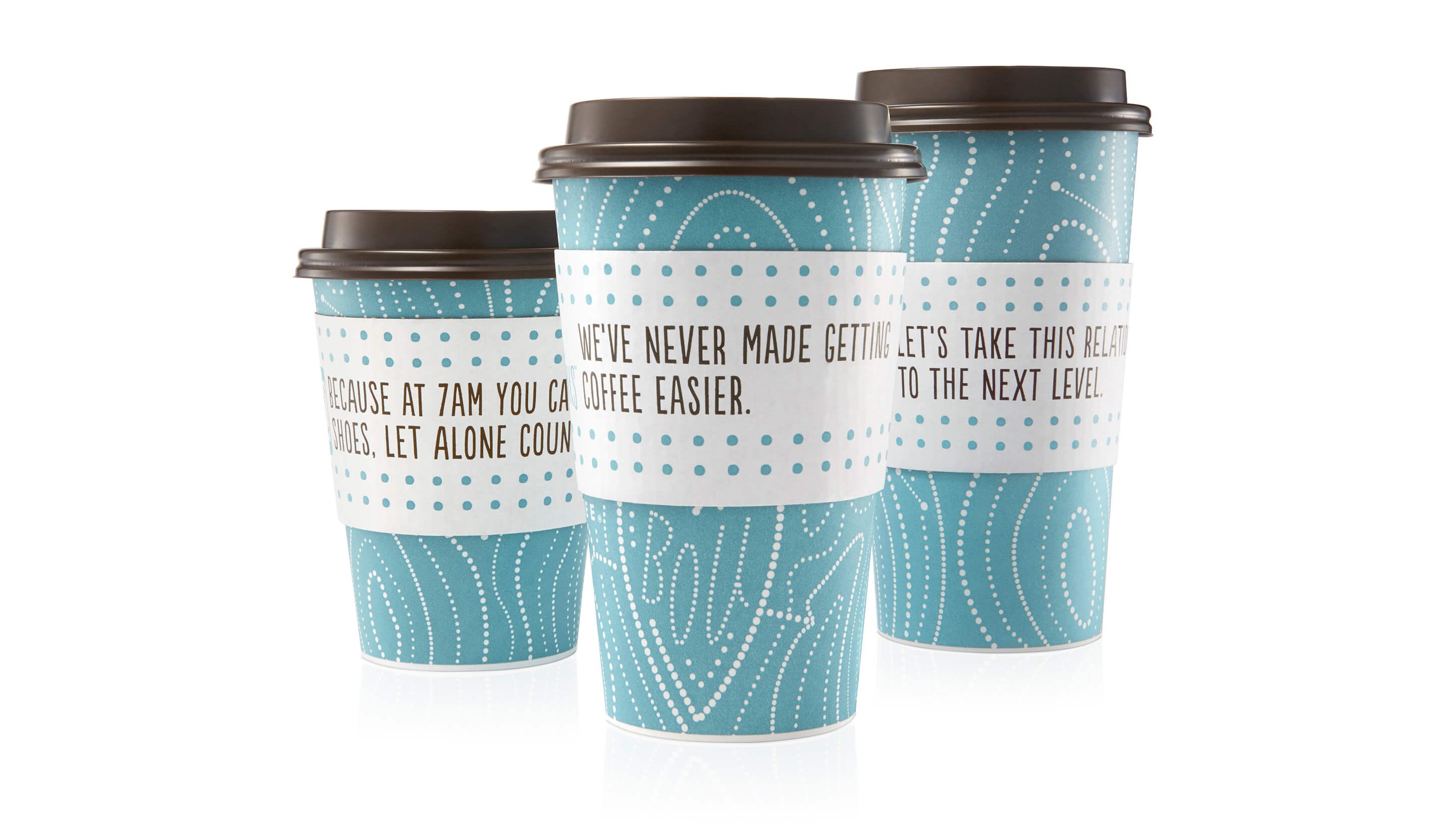
That mountaintop moment and the Alaskan northwoods surroundings, all extrinsic elements symbolizing the intrinsic values to Dream Big, to Seize The Day, to Enjoy Life To Its Fullest. These symbols and more, deliver an emotional wallop that embraces you upon entering a Caribou coffeehouse…a warm wallop to be leveraged on pack, on cup, on mug and to be felt in your soul.
In Conclusion
More Beans Bought
Leveraging the iconic Caribou Coffee expression on pack has brought a bit of their iconic coffeehouse experience to the aisle. True blue Caribou.